Top Posts
Author

Orca Journeys

Module 1: Assignment 2

Blog Improvements

Why I Choose to Create a New Site

When I heard we were to create a UX blog for our first assignment, I was filled with excitement. I knew exactly where I was going to locate it. The idea to create a subdomain named Orca Journey’s (dachilledesigns.com/orcadesigns) felt so right to me. That was until I realized it’s presence would be impacted.

Since I tackled this assignment with the introduction of a new site, I decided I would discuss the improvements for this module in a broader context for you.

Improvements

1 Blog + 1 Blog = 2 Blogs

Since my introduction post I have had to support an additional blog to my site for my Social Media Concepts course with Professor Miner. This was bit of a challenge for me considering WordPress is a one blog platform. The idea of expanding my blog, sounded great. However, I knew Professor Akselsen and Professor Minor would be visiting my site for completely different content and reasons. These sections had to be separated.

After searching the web I discovered it was possible to give the illusion of having 2 blogs on one WordPress. (You can click here to learn more)

How to Create a Two Blog WordPress

Step One: Category Update

The first thing I needed to update before considering how I would reconfigure my navigation, was to enable categories for my posts within WordPress. On default you will find that your posts will be labeled as “Uncategorized”. After enabling categories for my posts I created two new categories. One for my Web Techniques course labeled “Web Techniques” and “Social Media Concepts” for my Social Media Concepts course posts.

Menu Structure

Instead of redirecting my users to a “New Page” I had to redirect them to a specific “Category” to give the illusion of 2 blogs on one site.

I felt that it was appropriate to use a drop down menu labeled “Classes” for these two blogs. I kept “Home” the same, because I knew there would be users that would be interested in both subject areas. Therefor, when you click “Home” on my navigation or visit orcajourney.com you will see all of my blog postings. The category pages will allow me to easily enable posts that live within their category.

Orca Journey's mobile navigation before
Orca Journey's mobile navigation after

Additional Improvements

FIRST BLOG POST

Along with these navigational updates, I have made minor updates to the layout, typography, and colors in my introduction post such as,

  • Center aligned welcome message
  • Separated About me and Orca Journey overview with different background colors
  • Added more links (That open as a new tab)
  • Added recent posts and search by category at the end of my blog post to allow users to continue to browse the site.
Introduction Post Before
Introduction Post After
3 Facebook Twitter Google + Pinterest
Module 1: Assignment 1

Site Comparison

I have been tasked with the assignment to compare two different sites. One in which I think is well executed and one that I consider lacking in important respects. For this assignment I decided to move forward with Fitbit and Craigslist.

Fitbit.com

FITBIT

Fitbit has been my favorite site since their second tracker, Fitbit Flex was introduced in 2003. As a web designer and an active customer it’s been fascinating to see their website and mobile application evolve into a huge success.  I love Fitbit’s flat UI design elements, professional lifestyle imagery and interactive branding elements. Their product description pages combine compelling imagery and interactive elements. I find that these pages tell a great story and trigger emotional connections for users to absorb. They create lasting impressions for any fitness lover.

After regularly visiting their site you will notice that the shapes used in their branding also resembles in their products with rounded corners. Such as their scale, Aria which automatically syncs your stats and trackers.

A few other noteworthy pros,

  • Use of transparency and layout.
  • Experience from desktop to mobile app feels visually seamless.
  • Clean legible typography
  • Good use of whitespace
  • Embodies fun personality

Craigslist.com

CRAIGSLIST

Craigslist has remained relatively the same since 1995. It has a very plain and wireframe look to it. It looks as if the site launched before it got to design.

Need for improvement:

  • No branding (Colors, Logo, Voice, Typography)
  • Minimal listing customization (Listing layout)
  • No verified users or verification to post listings
  • No branding = No voice
  • Homepage not visually attractive

What I like about their layout:

  • No advertisements
  • Up front categories reduce clicks
  • Similar to newspaper structure
  • Filters / Subscription Alerts
  • Breadcrumbs
  • By pass login / Easy to post content

Craigslist.com

CONCLUSION

Although, I consider Craigslist.com lacking important points there are many reasons why it is structure the way it is today. Hence, it remains popular because products and services are categorized with the customer in mind. It takes just a few seconds to receive results from a search. In addition, you do not have to subscribe, fill out a questionnaire, or dig around to find what you are looking for.

3 Facebook Twitter Google + Pinterest
Module 1: Part A Assignment

Clay Shirky – How Social Media Can Make History

The revolution of media is fascinating in the way new technology is constantly changing the way we communicate and develop relationships. Clay Shirky thoroughly demonstrates how the media of the 20th century was limited with tools such as the printing press and broadcasting, until the introduction of the internet. The internet has forever changed the way we look at media and produce it. Shirky explains that the every day consumer also becomes a producer.


The internet went live to the entire world on August 6th 1991. It was a game changer in many ways. It was at this time that we had access to communicate with each other; peer-to-peer and groups. The internet is the central access point for people to talk with each other and share information broadly amongst each other. Shirky’s TED Talk he states,“The internet is the first medium in history that has native support for groups and conversation at the same time.” Technology would now allow you to place calls, take photos, record video, and surf the web interchangeably. When there are multiple access points introduced to complete a task, the experience becomes increasingly more social. It is evident here that the ability to share content on the internet has rapidly increase. While peer-to-peer communication is not forgotten, its social impact diminishes when produced.


Whereas the phone gave us the one-to-one pattern. Television, radio, magazines, books, gave us the one-to-many pattern. The Internet gives us the many-to-many pattern.


As TED speaker Clay Shirky points out, when information is produced by these social media channels “it can leak out like wild fire”. Hot entertainment, politics, or tragic events are discussed immediately way before they hit magazines, newspapers, radio stations or local news channels.The internet has given us what Shirky refers to as the “many to many pattern”. A good example of the “many to many pattern” is our recent devastating flooding in Houston, Texas. 


A Texas National Guard soldier carries a woman on his back as they conduct rescue operations in flooded areas around Houston. Credit: Lt. Zachary West, 100th MPAD/Texas Military Department/Handout via Reuters


Last week hundreds of stranded Texas residents sought help by posting on Facebook and Twitter. They tweeted their locations during the flood to emergency officials. Rescue missions were organized through existing and newly created Facebook groups. Event pictures and videos were posted which allowed the whole world to see the reality that Houston was facing as it was happening. 
Suddenly you have millions of Twitter users acting as producers.


The really crazy change is here: the fact that former consumers are now producers.


The development of the internet is amazing. To think that the last time we had a major hurricane was in 2005 and Twitter did not exist at that time. The people in Houston found dialing 911 was not the solution to get help. They used Facebook, Twitter, and Nextdoor for help. Officials did urge people to use all sources because as much as social media can help, it can also hurt as well. There have been reports of year old pictures and rumors being posted and spreading just a fast. So the need for mainstream news sources and weather reports will still always be important.


As this tragic flooding event continues, social media platforms from Reddit, Twitter,  to Instagram have been flooded with requests for rescues. Nextdoor, which is a popular social media site for neighbors said it has seen an unusual amount of users in the Houston area. Although pictures and video footage can not fully describe these events, we will have much more information to react to these tragic situations. Our media landscape will not only continue to change history, but will create many more opportunities for population dialogue where people can look back and learn from past events. There will be more exposure of personal narratives. I believe it is these trends Clay Shirky highlights in his TED Talk that will continue to lead to more opportunities and educational growth.

News about #Houstontexas on Twitter

How Social Media Can Make History - Clay Shirky

3 Facebook Twitter Google + Pinterest
Hi I’m Diana D’Achille

Welcome to my Blog. 

Hi there. Welcome to my User Experience blog. I will be documenting my progress throughout my Web Techniques and Social Media Concepts fall semester here. Be sure to bookmark us to follow along. 🙂

A little about me.

I was born and raised in Denville, New Jersey. My father is a computer science professional, so I have been exposed to art and technology at a very young age. My grandmother is a talented fine art painter; a dedicated artist who works long hours. Having the opportunity to attend many of her grandmother’s art shows gave me an initial interest in art.

Currently I am a Senior Brand Visual Designer and Creative Lead for Verizon’s Personalization team. I have worked on numerous innovative projects and have been responsible for many of the visual elements on the Verizon’s website. Some of my assignments have included homepage marquees, landing pages, UI concepts, UI redesigns, and lead designer for many of Verizon’s campaigns and device launches.

I graduate from Marywood University with a BFA in Graphic Design and a minor in Multimedia. During my time at Marywood I was a four year member of Marywood’s cross country varsity team and a three year starter for the lacrosse team. Recently I earned a Mini Masters User Experience Certification from Rutgers. In 2014, I successfully completed a Web Master’s Certification from the County College of Morris. Currently, I am attending Quinnipiac University to pursue my Masters degree in User Experience. What I like most about my career is staying on top of the forever changing edge of technology. I am always looking to learn something new.

When I am not sitting at my desk designing, you can find me releasing energy in any physical activity. I love the outdoors, being around people, spending time with my dog and competing in 5k races for charities. I contribute my positive and energetic personality from eating healthy and staying fit. I find that most creative ideas are found on my daily runs. My past involvement in sports has taught me the importance of time management, discipline, and perseverance; qualities that every designer should possess.

What will you be blogging about?

Orca User Journeys.

This blog will consist of all my Web Techniques assignments and learnings. I will be breaking down my assignments into easy to read units that result in a completed project.

What’s the whale all about?

Flipper is a friendly curious whale on the pursuit to simplify and optimize real world experiences he encounters. He is ready to embark on this journey with me, crush pixels and overcome everyday user challenges.?

Design is an interesting word. Some people think design means how it looks. But of course, if you dig deeper, it’s really how it works. – Steve Jobs

5 Facebook Twitter Google + Pinterest

Chapter 9: Animate

Chapter 9: Animate

Chapter Nine “Animate” was all about thinking about your animation (big picture) frame by frame. It is important to not only have all the tools to create an animated story, but also focus on unifying your elements into motion. Chapter nine started with an immense amount of encouragement. Liz Blazer stated, your animated project will work just as planned. You only need to follow a few insider tips that will keep you centered and moving forward towards your goal. 

Building up confidence to tackle your project is one of your first steps. Tackling the low hanging fruit first is the most fun, short, and easy to animate scene. After you take care of the “low hanging fruit” you can move on to the more intimidating and difficult sequences. The best way to go about this is breaking it into pieces.

When you break up the challenging components in your animation you will not only create less intimidating content, but also will reinforce the important notion that animated sequences are often mini-story arcs with distinct beginnings, middles, and ends. Liz Blazer presents an example of the “Launch of a Spaceship” to express the energy, forward momentum brought on by fire to the final lift-off.

Fundamental 1: Get out of the center – Try not to plop your subject in the center of your frame (too often)

Fundamental 2: Mix up shot length – Mix up your shot lengths. Long shots, to medium shots, and then close ups.

Fundamental 3: Mix up shot timing – Vary the time of your shots so your sequences move at different paces. 

Below is a recap of Animate,

Animate Recap 

1. Easy shots first to gain confidence 

2. Break up tough shots into pieces 

3. Plan well so no animation is cut 

4. Back up your digital files 

5. Pose your shots before animating 

6. Movement tip: Always anticipate and follow through 

7. Compose directional movement for whole film 8. Compose shots so subject isn’t always in the center 

9. Mix up shot length throughout film 

10. Mix up shot timing throughout film 

11. Add blur and vignettes 

12. Be flexible with soundtrack 

13. Listen to sound while animating to hit sound marks 

14. Mute your soundtrack to check movement

It was interesting reading about key poses that elaborate your sketches. Key poses provide a guide to ensure that all of your planned movement is possible. Your key poses include all of your elements- your background, props and text. They focus on the “before and after” movements that help illustrate the physics of gravity on weight and movement. Liz Blazer also goes on to discuss the importance of anticipation and follow through. Anticipation and follow through are as important as your “main” movements. They make your animation feel natural.
Paths for directional movement.

Animation Inspiration

UI Animation: Inspiration

During this module I explored different UI elements, animations, trends and movement. My goal for our assignment was to complete a UI animation from complete scratch while following Liz Blazer’s frame by frame process discussed in her Animate Chapter. I was particularly interested in UI animations that had smooth transitions, elegant interactions and seamless loops. I did most of research on desktop and mobile UI animations, but also came across a few UI tablet animations that were inspiring. What amazed me was the number of creative ideas. A few of the UI animations I came across animated similar elements, however they were all unique in their own way. I used Dribbble, YouTube, Google and browsed a few of my favorite mobile applications to find inspiration for my project. By using a #UIAnimation and #UXAnimation hashtag I was able to discover well executed UI and UX animations within their category. I also found that @UIDesignPatterns on Instagram had some great concepts and animations that stirred up a lot of inspiration for me.
Most of the inspiration for this module I found online and Instagram. Instagram was extremely useful since it allowed me to search for specific hashtags. For an example I was able to see the too posts within the hashtag #UIAnimation. This allowed me to find well executed stop motion animations and also be specific for what I was looking for.

UI Animation #1

Sometimes I find the best inspiration comes from learning something new. In this After Effects motion graphic tutorial Mike Ridolfi (@MikeInHD) reproduces a beautiful Material Design Google Music App. His tutorial is based off of the UX design shown when Google unveiled Material Design in 2014. In addition, this material design after effects tutorial should have show you everything you need to know to create an app design in Photoshop / After effects and give you a general insight for graphic design tutorial techniques and app design tutorial for beginners.

UI Animation #2

Learning how to create an animated UI cursor was critical towards completing my UI animation this module. Ryan Duffy’s animation taught me exactly how to create an animated UI cursor in After Effects. It is important to understand that our users interact with desktop much differently than they would with mobile or tablet. With a laptop (desktop) the users will click links and pan around with either their (wireless/non-wireless) mouse or trackpad. With mobile the user will use their fingers to interact with different UI elements. Given that mobile users use their fingers to interact with their screen, I needed to convey the touch of their fingers on my UI animation. Ryan Duffy’s tutorial was exactly what I was looking for. He inspired me to breakdown the creation of a UI cursor in easy to learn parts.

UI Animation #3

This was one of the first navigation animations I came across, with a quick “Navigation Animation” Google search. What I like about this user interface animation is the interactive animated clicks and perspective. It feels as if you are the one controlling the mouse. The panels that flip to create words is a very inspiring and creative idea. You can tell the animator made sure the sound effects were precisely aligned with the users clicks.

UI Animation #4

Ludmila Shevchenko showcases Tubik’s design agency services

This UI animation by Ludmila Shevchenko showcases the services Tubik’s design agency provides for. I absolutely love the color pallet that Ludmila used for her animation. The variety of colors used in the interface echoes the variety of services it Tubik provides. It certainly creates a positive first impression and supporting positive user experience with engaging design solutions. You can find more of Ludmila’s work here or her agent here. 

UI Animation #5

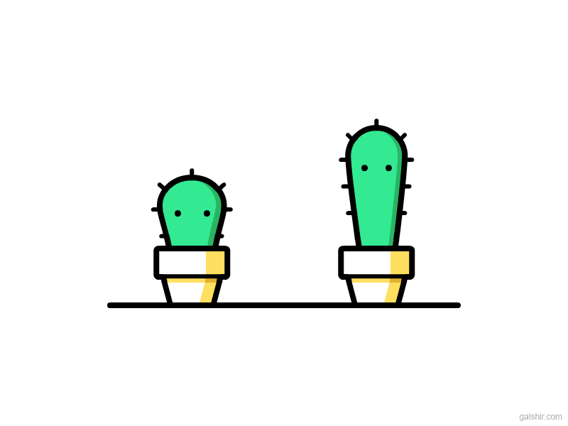
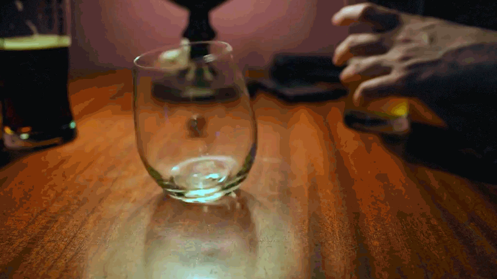
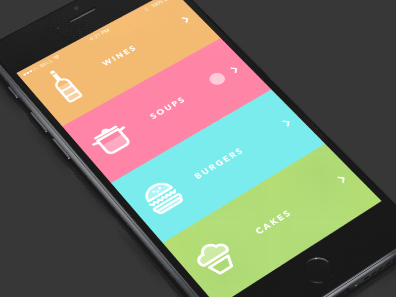
I love how the food icons bounce when the user glides their finger down the content bar. Even the liquid in Sergey Valiukh’s food icons have a personality of their own. The colors are fun in an attractive way and also separate the sections well. It is evident that Sergey Valiukh’s attention to detail and motion was critical component to complete this UI animation.

UI Animation #6

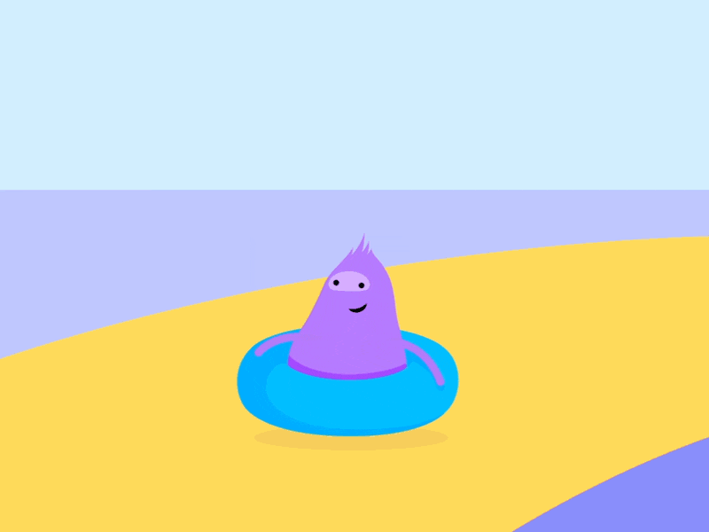
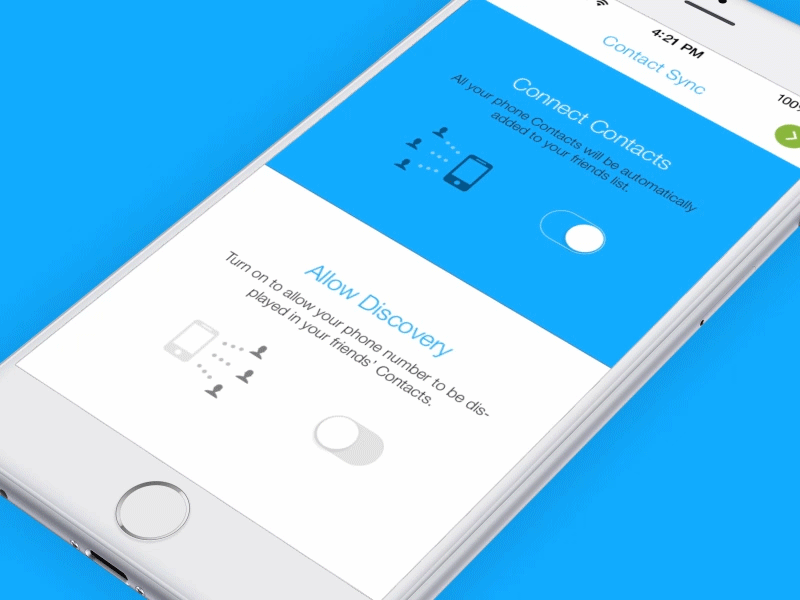
I really like the imagination that went behind this UI animation. Those of us in and even out of design all know how a radio button does on press. You can either slide it left or right. However, what Ramotion completed pushed the concept further and made it attractive. With Google’s Material design, not only is this doable but it is a simple solution that makes for a well executed UI animation.

Puppy UI Animation

Low Poly Puppy - UI Animation

Overall I had a lot of fun with this project. My favorite part was concepting. After collecting my interface animation inspiration from various sites and watching several Youtube tutorials I was ready to build on a interaction. Going into this project I had a lot of ideas, such as a virtual zoo or iMessage conversation. These ideas sounded good on paper, but would not fill the requirements as well as I imagined. Selecting a UI animation that would show the user where the cursor is (or in this case where the user will tap the mobile screen) was just as important as looping it.

I started on paper with a few sketches. I knew I wanted to do a mobile device UI screen, so I began by making a few vertical rectangles to represent the devices screen. Combining my own illustrations within my project was very important to me. Using royalty free images is great if it is sourced, but using your own work is even better.

After watching Youtube tutorials specific to After Effects “effect panel” last module I had a better idea how to work with effects and key frames going into this project. I hit several road blocks, such as getting my dog illustrations clipped to a shape and cropping my After Effects project. However, majority of these problems were resolved by a quick Google search. Seeing how other animators solved these issues as well as organized their composition and pre-compositions was very helpful.

I found that the reading this module helped me focus on one element at a time. It might be hard to tell, I have a couple interactions occurring at the same time in my UI animation. Such as the circle representing the users touch on the screen and puppy illustration. What I found useful during this project was creating multiple pre-compositions. This did not only separated my elements, but also kept my file extremely organized.

Puppy Illustration – I created my low poly pups in Photoshop and Illustrator. (Sketched on iPad Pro with a Apple Pencil)

Music – I decided to keep the music up beat and happy, without taking too much attention from the UI animation. Since puppies tend to give a happy and up beat impression I thought it was a good fit.

Sound effects – I used sound effects that would go along with the puppies and push the circle animation (that represents the users touch on the iPhone) further. It was important that my audience felt like they were participating the UI puppy interaction.

Audio – The idea of being in the environment of the puppies and participating in the UI interaction was incising. I knew when the puppies appeared I wanted to use sound effects for them as well as the users touch on the UI elements.

Animation – I wanted to incorporate a few of the 10 principles of animation that we learned from the previous chapter. Brainstorming ways I can incorporate these principles into my UI animation was a great re-cap. 🙂

Type – Originally, I wanted to animate the text in my UI animation. However, I did not want to take the attention away from the users interactions in my UI animation. Going into my project it was important that my UI animation was simplified and not overwhelming. I found that having static text was the perfect combination with the interactions since the copy would be easier to read and could be read multiple times without it leaving the stage.

Changing the skew of the puppies while maintaining motion was a challenging hurdle during this assignment. However, by creating a clipping mask on horizontal rectangle for my puppies I was able to control the dimension and size of the puppies a lot easier.
Tip - You can add markers to your timeline, so you can remember where your actions take place without using the timeline scrubber. I used numbers to mark important keyframes for my audio and illustration movements.
Tip - Adding a cursor to a Mobile device is different than adding one to a desktop UI. Unlike desktop where the user uses a mouse (triangular cursor) to click on UI elements a Mobile user will use their fingers to press on an element. We demonstrate this interaction by using an animated circle. By YouTubing "Animated Mobile UI Cursor" you can learn how to animate one from scratch.

Puppy UI Animation - (Gif)

Puppy UI Animation - Gif

After exporting my project I imported it into Photoshop to create a gif. It was important that my gif’s file was condensed. By using a minimal number of colors I was able to bring my file size down drastically. It was amazing that I was still able to achieve the vibrate look I was shooting for with a reduced amount of colors. When I was exporting my project as a gif in Photoshop I had the idea to add a static banner at the bottom. This was a great place to market my website that associates with my low polygon puppy illustration.
Adding e-commerce banner to .mp4 file in Photoshop.
UI Puppy Animation Gif
2 Facebook Twitter Google + Pinterest
Web Techniques Class Reflection

Web Techniques with Professor Akselsen along with my classmates has been a wonderful learning experience. If you asked me what a Web Techniques class like this would entail after reading the syllabus, I would have nothing but a rough explanation for you. I remember the first assignment being somewhat intimidating. We introduced ourselves in our classes discussion board and we were assigned to create an User Experience process blog. The User Experience process blog examples we were shared by Professor Akselsen were amazing and also very inspiring. It was funny to think we would have a completed User Experience blog at the end of this course tracking our progress.

It was not until a week or two into the class that I realized how much HTML and CSS plays as a key role in my concentration, User Experience. User Experience focuses on having a deep understanding of our users, what they need and what they value. As a User Experience designer we design meaningful and personally relevant experiences to satisfy our end users. As you can see User Experience is much like HTML and CSS. In the way we want to provide and structure the best experiences for our customers so they come back to our website, brand, service or product.

I found that the curriculum this semester was very informative and organized appropriately. The modules were very well laid out which made it very easy to relate any current event to what we were learning in class. Some of the subjects in our syllabus seemed familiar to me, however I was determined to challenge myself in every topic. The creative freedom Professor Akselsen exposed us to in our modules, allowed me to focus on advancing my skills no matter how basic or difficult the task entailed.

I highly enjoyed creating a mood board, color palette, site map and wireframes for my Craigslist redesign. Learning how to develop a structured user experience and design strategy helped me execute my assignments efficiently and professionally. I enjoyed reading my fellow classmates discussion posts on Blackboard. It was very easy to connect, help and share information regarding our assignments on Blackboard. It was really great seeing how my classmates digested the information we learned this semester from a different perspective. Receiving feedback from my classmates and Professor Akselsen helped me uncover information I missed and highlighted where I did well.

Although, this semester is coming to a close I look forward to using the web technique skills I learned these past several months. I did not realize how much information we covered until I took another look at our Web Technique’s syllabus! I plan on reiterating on the analytics / data best practices at work and using the user experience design processes for my personal projects. It is evident that the assignments I completed for Professor Akselsen’s Web Techniques class will serve as a solid stepping stone for my User Experience concentration at Quinnipiac University and make an excellent portfolio piece!

My Webspace Website

Code Playground Website

2 Facebook Twitter Google + Pinterest
Module 3: Stop Motion Animation (Production)

Chapter 6: Sound Ideas

Chapter 6: Sound Ideas

Chapter Six “Sound Ideas” was all about getting your audio and story in sync. It is important to not only have an amazing script for your animation, but also have music and sounds that work well with your animation. Chapter six started with a game of fill-in-the-blanks. It was a fun game that introduced me to the combinations and also possibilities of sound and visuals. Liz Blazer had us imagine what a specific visual sounded like. She used the example of lightning, a baby dropping his pacifier and Jay-Z strutting on stage. This made me recognize that sound is the result of an action and emerges out of an existing story. It is also notable that human emotions with sound can also create great impact.

I found the notion “Let sound lead your story.”, a very powerful statement. During my test stop motion animation I thought about the music and sounds I would choose after my stop motion animation filming was complete. It is now interesting to think I could have made decisions prior to filming based on the sounds that my objects would produce or the music that may work well with my storyline.

In production sound can be an afterthought. However, waiting to the middle or end of your animation can often be a mistake. When you are writing your production you should always be thinking about the sounds that your props make or what sound/music might sound good with them.

Here are some types of sounds,

Diegetic Sound (Literal) – comes from sources that are visible on-screen (or implied by action off-screen) and that come from the physical world: a dog’s bark, a creaking door, most dialogue (that is not in the head of a character), and music whose source you can see in the scene—such as from a musician or a radio.

Examples – Dialog – Actors Speaking, Door creaking.

Non-Diegetic Sounds (Non-literal) – are sounds whose source neither is visible on the screen nor has been implied to be present in the action. Sound effects that are not natural to objects in the scene (a sad trombone playing “wah-wah-wah” when a character realizes they’ve been tricked), the music score (that is not coming from a musician or a radio in the scene), and any off-camera narration or dialogue that’s going on in the mind of a character.

Non-diegetic sound is surreal to the action and yet aims to enrich what is happening on-screen.

Example: Narrator, Voiceover, Sound Effects used Expressively, Music Score.

It is evident that sound alone can paint a vivid picture of action.

Sound Ideas Recap 
1. Let sound lead story
2. Diegetic and non-diegetic sound
3. Sound effects
4. Music as sound effects
5. Music
6. Dialogue
7. Narration/Voiceover
8. Timing is everything
Diegetic VS. Non-Diegetic Sound

Chapter 7: Design Wonder

Chapter 7: Design Wonder

Chapter Seven “Design Wonder” was focused on world building and environmental design. Liz Blazer opens the chapter by stating, “Yes is yes, no matter how ridiculous an idea one player introduces into a comedic scene, the others must accept it as fact and even expand on its authenticity.” She then described an Improv comedy with a giant falling carrot to further explain what she meant by “expanding its authenticity”. She uses the giant falling carrot to show you that animation allows you to create any type of chaos you want.

Establishing a time and place for your animation is one of the best ways to make your animation feel authentic. After you establish a time and place the next step Liz explains is to to define the physical, social, and visual laws that exist there. This will help give your world a sense of authenticity and verisimilitude.

“Don’t just do it because it seems cool. Do it because it’s meaningful to the telling of your story.”

I really enjoyed reading the World’s Visual Law’s section on Motion Graphics and Branding. This section discussed the benefits of uniquely branding products, identities and logos in place of easily identifiable human or animal characters. She expresses that it is important to create distinct visual laws to capture your audience’s attention. By creating easily identifiable human or animal characters is one way in doing so.

Design Wonderland Recap 

1. Design consistent rules
2. Define time and place
3. Consider physical laws
4. Consider social laws
5. Define visual laws
6. Motion graphics—explore brand values
7. Motion graphics—establish visual rules
"Animated Storytelling" by Liz Blazer

Animation Inspiration

Stop Motion Animation: Inspiration

During this module I explored different storylines, color themes and mediums. I was particularly interested in using paper as my stop motion animation medium. I did a lot of research on stop motion animations that used paper or materials similar to paper such as cardboard and card stock. The amazing thing about paper is that although it is flat you can bend it to create 3d sculptures. I also found several stop motion animations out of clay. The clay stop motion animations inspired me to bend paper into objects similar to what was being done with clay.

Most of the inspiration for this module I found online and Instagram. Instagram was extremely useful since it allowed me to search for specific hashtags. For an example I was able to see the top posts within the hashtag #papermotion. This allowed me to find well executed stop motion animations and also be specific for what I was looking for.

#1 Stop Motion - Effective Audio - “Legos on the Beach”

I really enjoyed coming across this stop motion animation. It has inspired me to think closely about the sounds produced with the actions in my stop motion animation as well as the music. It is evident that Melissa (@BricksontheLoose) uses ambient audio sounds to evoke strong emotions through vivid imagery in her stop motion animation. You can tell that the Melissa took in a count every sound that would be produced by the actions of her lego figures. My favorite part in Melissa’s stop motion animation was when her lego man ate the green apple on the beach (28 Seconds). The crunching apple sound effect worked perfectly with her action and also was timed right when the apple touched the lego mans lips. I also thought It was helpful that the artist provided information where she uploaded her music and sound effects from. You can check out findsounds.com for sound effects similar to Melissa’s.

#2 Stop Motion - Effective Audio - “Bluetacks Animation”

For my second inspirational effective use of audio, I wanted to find a good example of a stop motion animation with ambient audio (Audio that gives a sense of place). During my readings this Module I was particularly interested in ambient audio. It seemed to be a great way to give your animation a more realistic appearance. I came across a lot of lego stop motion animations using this effect, however wanted to find something different. That is when I came across “Blutacks”. Yes, Andrew Minor’s stop motion animation is almost entirely made out of Blutack. He shot his stop motion animation with a Panasonic Lumix GF-1 using a tripod and edited it in Corel VideoStudio. Andrew has a nice title screen to introduce you to his animation. He also uses a number of sounds of musics that give you a sense of place.

#1 Stop Motion - Effective Text Animation - “Transforming Dots to Letters”

This After Effects tutorial by Evan Abrams is very insightful. In his tutorial he shows and explains how you can transform dots into lines, letters or really any other shape. He starts with dots and then transforms them into lines. From there he then makes his lines into letters. (Actually, Spoilers, it just looks like that.) What I found interesting is that his pre-production is completed in illustrator. This is where he maps out his project before executing in After Effects. The process he explained in Illustrator seemed to very simple, for any illustrator level to pick up. If you are interested Evan allows his fans to download his After Effect files here.

#2 Stop Motion - Effective Text Animation - “3-Dimensional Triangular Text Animation”

I came across my this text animation on YouTube, after typing in “Triangle animation intro title”. My favorite part about this text animation is the use of shapes transforming into introduction letters. The beginning of the text animation shows three-dimensional triangles fly into the screen. Once they start to fall to they begin to become 2d (flat/non-three dimensional). Once all triangles have all fallen they create a logo called “Alpine Rafting”. found it was interesting that Zooba Network created this text animation in Animation AEX7. Animation AEX7 was a program I am not familiar with or have heard about. To check out more of Zooba Network’s work you can go here. Zooba’s team creates, Product/Service Promo Videos, Logo Openers, 3D/2D Logo Intro/Outro Animations, Title Animations, Explainer Videos, Whiteboard Animations, Logo Designs, Website Design & Developments, Full Corporate Brand Designing.

Stop Motion Animation - (Linear)

Banana & Peanut Butter - Stop Motion Animation

I had a lot of fun with my linear stop motion animation. Creating my storyline and storyboard prior to starting my animation allowed me to brainstorm fresh ideas and execute a project focusing on the beginning, middle and end sequences. I chose to make a peanut butter and banana sandwich for my stop motion animation, because the plot would be flexible and my favorite thing to eat is a banana peanut butter sandwich.

It was great working with my storyboard. I tried to match it as closely as possible during production. I was surprised how it reflected in my animation.

The Challenge:

It was challenging not to move the plate, peanut butter jar and banana slices on my set by a mistake. I found during my test stop motion animation that it was very easy to accidentally bump into elements or mistake the last position of the shot. It became helpful to preview my photos during my shoot in this case. What I found helped me was moving the banana slices with a tooth pick and lightly marking where the items would end with a pencil. When it came time to edit my photos the pencil marks vanished immediately when I increased the exposure of my animation.

One if my favorite parts of this assignment was adding the sound effects. After reading Chapter 5 on Sound Ideas, I had a much better idea how to use and apply sound effects on my stop motion animation. The inspirational videos I found on YouTube gave me great recommendations to find sound effects for free online.

Sound Effects:

I felt that the sound effects would work best with my Peanut Butter and Banana animation since there were many objects involved in my storyline. (Peanut butter jar, plate, knife, bread bag etc.) The materials that produced noises matched great with the sound effects I found online. (www.freesound.org/) It made my animation stronger and more enjoyable to watch. It was a lot of fun searching for these sounds. When it came time to add them into my animation it was important that they were precise. What helped me the most was zooming into my timeline and using the clip trimmer. This allowed me to align my sound effects closer to the start or end of an action.

Lighting:

The camera ring my grandmother allowed me to borrow had two lights connected to it. I played around with the direction of the lights on my grandmothers rig as well as the height of the rig with my camera on it. I ended up keeping the rig at a similar height that I used for my test animation. At first I positioned my lights off the wall as Professor Golden recommended, to give my objects a softer shadow. However, after playing around with the soft shadows and hard shadows I decided to give my objects harder shadows for a more bolder dramatic look.


My grandmother was kind enough to allow me to use her camera rig for the aerial shots.

Stop Motion Animation - (Non-linear)

#2 - Stop Motion Animation (Non-linear)

For my second animation I wanted to combine my low polygon animals with paper stop motion animation. After conducting research on stop motion animation techniques and completing our readings I had a better idea of how I would complete my animation. Prior to completing this project I had many ideas, however have come to the conclusion that less is sometimes more.

I decided to recreate my low polygon killer whale after the site I have been publishing my work to, orcajourneys.com. Killer whales are magnificent creatures that have unique color patterns. It was important to me that I represented my whale in as few colors as possible while contrasting something realistic.

The Challenge:

The challenge with this one was very similar to my Banana and Peanut Butter stop motion. I had to be very careful to not move any of the orcas triangles by mistake. I used a toothpick to move the triangles together and apart. When it came time to move triangles from my orca it was a lot easier to construction/deconstruction my orca with a toothpick and rotate the pieces with my hands.

Lighting:

Lighting was tricky especially since I was using colored paper. I wanted to provide enough light to eliminate any distracting shadows and make sure the blue hue of my paper did not not wash out in the light. Since my paper triangles were flat having hard shadows was surprisingly more effective than soft shadows. The shadows under my paper stoped hard, rather than extend out. The shadows of the triangles were directly under the paper. Further more, the “hard shadow” method seemed to “outline” my triangles making them bolder and more defined over my cyan paper.

Colors:

I started by printing my digital orca low polygon design. I cut out triangles to reconstruct the whale with 4 colors, black, gray, white, and blue. It was difficult matching the identical size and number of triangles from my digital design. So, I ended up cutting a black piece of paper first that outlined the whale. I then began to cut the whale into triangles.

Process:

Once I finished cutting out all my triangles I placed them on a flat clean surface. Originally, I thought I would need to bring one triangle in at a time to build the whale again for this stop motion animation. Boy, was I wrong. After watching Melissa’s YouTube video I had a better idea how to start and end my animation. Instead of recreating the whale I took triangles away from the whale. This helped tremendously, since I didn’t have to remember where each individual triangle belonged during production.

After I shot each frame I uploaded my photos into photoshop. To save time I imported the photos as frames. I then added filters and increased the saturation to color fix the photos I took. It was nice not having to manipulate this project as much as I did with the previous cinemagraphs I created, but I still needed to touch up the photos coloring quite a bit. It was evident that Photoshop was a great tool to use for editing stop motion animations.

Music:

For my orca stop motion I wanted to use friendly/calming music to evoke curiosity. I also wanted tell the Non-liner “Puzzle” format storyline with music/sound effects that would not reveal what the triangles would create in my storyline. At first I dabbled in orca and ocean sound effects on freesounds.com. Since this was a Non-linear “Puzzle” format storyline, I decided to stay away from sound effects being placed at the beginning of my animation. I moved the orca noise I had at the beginning of my clip to the end and added music to my timeline. This song kept my audience in the dark about what the triangles were creating and had a nice calming tone to it that I think captures the whale well.

I cut out my low polygon orca to help me recreate the whale out of paper.
 

Test Animation

Test Animation (Testing 1, 2, 3)

Here’s a test clip of my stop motion animation. I recorded this animation prior to diving into my linear and non-liner stop motion animation. It helped me adjust the camera table rig that was holding my Canon, adjust the lights that were attached to the table ring, play with the focus, and try a few different techniques I learned.


Funny story – Was just about to take a shot at the #3 I drew when I experienced a power outage. Luckily when the power went back up (4 hours later) my objects remained in the same position and the lighting was the same. Phew.
3 Facebook Twitter Google + Pinterest
Module 3: Stop Motion (Pre-Production)

Chapter 4: Color Sense

Chapter 4: Color Sense

“Chapter Four: Color Sense” and “Chapter Five: Weird Science” were two enjoyable reads. I was particularly intrigued by “Chapter Four: Color Sense”. Color Sense was unlike any chapter we read so far in Liz Blazer’s book Story Telling. “Color Sense” was all about selecting the correct color palette to enhance your storyline. Liz Blazer provided simple guidelines to plan your palette and enrich your story with well-informed color choices. It is amazing that color can tell a story of it’s own. It can express emotion, clarify motivation, and dictate the entire meaning of a piece. 

Here are a few definitions that I heard of, but was not entirely familiar with their definitions. I decided to type them down since Liz mentioned that we would be using them throughout the chapter as well as the value chart below.

Hue – refers to the common color name in the spectrum like red, blue, green, blue-green, and so on.

Saturation – is the intensity or purity of a color. Highly saturated colors look vibrant and bright while low-saturated colors look dull, almost grayish.

Value – is the relative lightness or darkness of a color—basically how much light the color is exposed to determines its value. Low value means a color is closer to black.

Creating a color script requires you to reuse your cue cards from the previous chapter. A color script is a script that is a sequential visual outline of how you intend to use color in your animated film. I like that this process is highly experimental and somewhat unusual. By limiting your color palette your eye has time to explore and investigate compositions. The hardest part seems like it would be to define your storyboard in one color. Especially, if your story board uses a variety of colors throughout it’s script. I thought this was a very neat approach to creating a color script. Liz Blazer explains that by identifying the key moments in your script you can understand the color for emphasis behind it. 

Pre-color script (PCS) – This is your storyboard represented by a series of single colors, one for each board. (Each color in the series can be repeated.)

Color Recap Color Vocab: Hue, Saturation, and Value Make Color Scripts to Emphasize 

Key Moments 

Tip 1: Limit Your Palette 

Tip 2: Support (Don’t Upstage) Your Subject 

Tip 3: Select One Thematic and One Accent Color 

Tip 4: Use Saturation Mindfully 

Tip 5: Use Surprise Color for Punctuation 

Tip 6: Design for Movement 

Tip 7: Make Your Own Rules

Color value diagram.

Chapter 5: Weird Science

Chapter 5: Weird Science

Chapter Four: Weird Science

Chapter four, “Weird Science” discussed the history, need, and process for experimenting with animation. Liz Blazer, provided several visual examples as well as a case study to have us think like a professional animator. This chapter reminded me a lot of the Introduction and first chapter, however brought together some of the ideas and concepts we learned in the previous three chapters. Experimentation is an essential step to getting the most out of the animated process. Experimenting with animation can furthermore help you to define moments in your work. I was surprised to read that some skeptics fear the word experimentation. These skeptics believe experimentation implies whimsy, which they believe is synonymous with wasting time. It is evident that the meaning of experimentation is the complete opposite of what these skeptics believe experimenting is all about. Experimentation can even benefit the oldest most sacred techniques and methods. 

The importance of creating “Bad” Art was not a experimentation method I thought I would read about during this chapter. art. Creating “Bad” Art requires you to forget about careful color choices, go against your instincts with design and technique and ultimately get in there and make a mess. However, I can see how this method can allow you to generate new ideas and let go of ideas that you should probably step back from. It is evident that may even decide to incorporate some of your “Bad ideas” into your final project.

Here are the steps to apply your “Weird Science” to your current project:

Your Film’s Experimentation List

  1. Draw up a graph with each scene’s number on the left side and a series of columns at top listing areas where you might experiment with those scenes. (Examples – Technique, Design, Movement, Transitions, Sources, and Sound) 
  2. Consider how your project as a whole might benefit from each area of experimentation. You may decide that there are many possibilities or just a few. 
  3. Go through each of your storyboards one by one and consider how you might experiment with each of the topics listed in the column. If you think there’s something there, take your best, wildest shot. 

“Make the work you want to be hired to do” was a really powerful focus in chapter four. To many times we create work strictly inspired by specific medium or concentrations. We skip the big picture of what type of impact our work will have on our viewers. When a designer or animator gets known for doing something well, clients will come back for that specific that thing. Having a design or animator style is great, however It is very important to switch things up a bit and really create what we want to be paid to do. Side projects allow us to do these experimental opportunities when there is no room within our current occupation to execute such a piece.  Liz Blazer’s provides a very good example of this showcasing Marco’s Study. Macro Study features filmic title sequences with dark, suspenseful soundtracks and close-up images of everyday objects shot with a macro lens. It was the work Marco wanted do and be known for. It is clear to me that Marco was making work that he wanted to be hired for. 

Weird Science Recap 

1. Free yourself to make “bad art.” 

2. Work on the edge of your skill set. 

3. Make the work you want to be hired to do. 

4. Keep working on your personal projects. 

5. Make a Project Experimentation List. 

6. Experiment with transitions. 

7. Experiment with movement.

"Animated Storytelling" by Liz Blazer

Animation Inspiration

Stop Motion Animation: Inspiration

During this module I explored different storylines, color themes and mediums. I was particularly interested in using paper as my stop motion animation medium. I did a lot of research on stop motion animations that used paper or materials similar to paper such as cardboard and card stock. The amazing thing about paper is that although it is flat you can bend it to create 3d sculptures. I also found several stop motion animations out of clay. The clay stop motion animations inspired me to bend paper into objects similar to what was being done with clay.

Most of the inspiration for this module I found online and Instagram. Instagram was extremely useful since it allowed me to search for specific hashtags. For an example I was able to see the too posts within the hashtag #papermotion. This allowed me to find well executed stop motion animations and also be specific for what I was looking for.

Stop Motion Animation #1 - (Snowman Carrot Nose Morph)

This stop motion animation has A LOT of frames. It in fact has so many frames that it seems to feel more like a video than a stop motion animation. Although, we all know these are fictitious characters made out of craft materials (clay). The storyline is fun which is also why I decided to pick this stop motion animation. The idea that the fish transform into the snowman’s nose is an entertaining and well thought out execution. I did not expect the fish to transform into a carrot for the snowman’s nose. It is evident that the concept of not expecting something to happen is a very intriguing technique.

Stop Motion Animation #2 - (Paper Storm)

This is one the first stop motion animations I came across during my research phase and also one of my favorites. It is neat to think that a number of photos were combined to create this animated affect. I also like how the artist used her hand in her stop motion animation. The combination of cut out paper and hand movement makes for a successful composition. She also uses a limited color palette. The colors she does choose to use are fun and bright colors, other than the thunderstorm cloud. It is evident that this animation does a great job capturing a story through colors, shapes, and movement.

Stop Motion Animation #3 - (Food Fight)

During my inspiration phase I focused my attention to stop motion animations using paper and unusual items. I was particular interested creating a storyline with food items, so I went ahead and researched stop motion animations using food. I was surprised to find an assortment of different stop motion animations after googling “Food stop motion animations”. There was a mixture of linear storylines and non-linear storylines using the formats we learned from Liz Blazer’s book. Having the food “realistically” come to life was what I was most interested in accomplishing. Above is what happens when you you Youtube “Food Fight Stop Motion Animation”. I thought it would be funny if the food items acted like people, so I went ahead and searched for “Food Fight Stop Motion Animation”. To my surprise I found exactly what I was looking for. Food throwing food at food. This was a great example of a stop motion animation using food, while applying a creative humor twist to it. I used this as inspiration for my first stop motion animation using a linear storyline.

Stop Motion Animation #4 - (Origami)

I love that this stop motion features different animals made out of paper. There is something about it that makes it feel extremely real. The sound effects of the animals during this stop motion is definitely a bonus. I also admire the 3 dimension the artist is able to achieve with her medium, paper. I have seen a mixture of 2d and 3d paper stop motion animations. However, I have definitely gravitated more to the 3d paper stop motion animations.

The idea of using a wide range of materials to create a stop motion animation has peeked my interest this semester. Origami is such a fun arts and craft activity for both kids and adults. To see the paper come to life to form these delicate figures is such a fascinating site. Using paper to create 3-dimensional objects is definitely an effective technique.

Stop Motion Animation #5 - (Winter Olympics)

I really liked how the storyline in this stop motion animation was relevant. It captures a paper figurine jumping off a winter Olympic slope, which is made out of paper as well. The set is very well put together as well as the photos. I came across a lot of stop motion animations that lacked quality or did not have either a compelling linear or non-linear storyline. The readings on linear and non-linear storyline’s definitely helped me create something one of a kind and also interesting. I would consider this stop motion animation as a successful example of a linear stop motion animation storyline.

Test Animation

Test Animation (Testing 1, 2, 3)

Here’s a test clip of my stop motion animation. This test stop motion animation clip will prepare me for production. Having completed this test I now have a better idea of what my linear and non-liner stop motion animation will need. I learned during this test animation how to adjust the rig I had that holding my Canon, how to properly adjust the lights, play with focus/depth and try a few different techniques I learned.

I decided to use fruits and paper in my test animation, since the focus in both of my storylines use paper and fruit. I was curious what it would be like using these objects on a flat surface. At first I had some problems with the oranges (rolling off the set) and the paper (moving around). I found that marking spots very lightly on my set helped prevent misplacing my previous shot. I also learned that moving objects with a tooth pick works really well. I plan on using these techniques in my final stop motion animations.

Funny story – I was just about to take my last photo of the #3 I drew when I experienced a power outage. Luckily when the power went back up (4 hours later) the lighting and positioning of my objects were the same. 🙂 *phew*

Stop Motion Animation - (Linear)

Banana & Peanut Butter - Stop Motion Animation

I had a lot of fun putting together my stop motion animation storyboard and storyline summary for my banana and peanut butter idea. The idea is to evoke emotions of the audience with food. I plan on having food utensils come to life that will create a banana and peanut butter sandwich for my stop motion animation. The food products and utensils will play around the set prior to creating the banana and peanut butter sandwich to curb the hunger of the audience and prepare to solve for the problem of hunger and preparation. The problem (hunger/appetite) will be resolved once the sandwich is completely eaten.

Creating my storyline and storyboard prior to starting my linear stop motion animation will allow me to go into my animation with fresh ideas and execute a project focusing on the beginning, middle and end sequences. I chose to use a peanut butter and banana sandwich for my stop motion animation, because my favorite thing to eat is a banana peanut butter sandwich.

Stop Motion Animation - (Non-linear)

Orca - Stop Motion Animation (Non-linear)

For my second animation I would like to combine my low polygon animals with paper stop motion animation. After conducting research on stop motion animation techniques and completing our storyboards I have a better idea of how I would complete my animation. Prior to completing my storyline summary I had many ideas, however have narrowed my ideas down and have been able to focus on my storyline.

I plan on recreating my low polygon killer whale after the site I have been publishing my work to, orcajourneys.com. Orca whales are magnificent creatures that have unique color patterns. They can be recognized by the human eye with a minimal number of colors and shapes. It was important to me that I represented my whale in as few colors as possible while constructing something realistic.

I will be recreating my whale, paper triangle by paper triangle until the entire anatomy of my whale is constructed. “The Puzzle” format will purposely keep my audience in the dark of what the result of my stop motion animation will be.


This is the Orca I plan on recreating in paper for my stop motion animation.

2 Facebook Twitter Google + Pinterest
Module 2: Mixing Motion (Cinemagraphs)

Chapter Two: Storytelling

Chapter 2: Storytelling

Liz Blazer’s opening paragraph for Chapter 2 was both inspiring and home-hitting. She explained that anything is possible and anything goes in the world of storytelling. She expresses, “Storytelling breaks the rules of gravity, tosses aside the space-time continuum, invents impossible worlds, and takes your audience on a journey simply with shapes, sounds, and colors.” I like that she gives multiple perspectives and touches on some of our five senses, sense of sound, sense of sight, sense of touch, sense of taste and sense of smell. Eliza also briefly touched on “history” in her opening paragraph. History is such an interesting variable in storytelling. You can tell a story from the past or the future no matter what date of time it is. There certainly is a lot to love about storytelling as Liz Blazer mentions, your imagination is the limit.

After the first paragraph of Eliza’s storytelling chapter she started to get into the subject matter deeper. She introduced two story telling-models that I was unfamiliar with, Standard Storytelling Model  and the Non-narrative Story Telling Model. She emphasized, “The great challenge is more about disciplining yourself to reel it in and be intentional about your storytelling choices.” Meaning, it was more about how much discipline you exercised in limiting your choices than creating a mind-bending world. I was determined to use this piece of advice through the process she walked us through next on the Standard Storytelling Model  and Non-narrative Story Telling Model.

Liz Blazer Three-Act-Structure was a lot of fun to read about. Learning about the Three-Act Structure within the Standard Storytelling Structure was both informative and inspiring. I noted the steps that Liz provided below for keeps and areference.

Three Act-Structure:

Step 1 – On a stack of (15-30) cue cards, go ahead and write down/sketch out all of the moments that move your story along until the conclusion. (Each card should represent an active step or beat in the storyline and can be both physical and/ or emotional.)

Step 2 – Place those on the wall in chronological order in three separate rows. These three rows represent a traditional three-act storytelling structure,

Step 3 – (Three-Act Story Structure) – 1. A character has a problem, 2. The character works towards a solution, 3. The character solves the problem, usually in a surprising way.

Step 4 – Next, create a fourth row of “additional beats.” You’ll put cards here that either don’t fit into your structure or that you simply don’t yet know what to do with (and which you may never use).

Non linear Structure:
It is evident that the Non linear structure offers more than the Three-Act Structure. Liz Blazer explains the Non linear structure is “a treasure trove for seekers of a more poetic, non-narrative, abstract style of storytelling.” It requires even more planning and attention to detail. Furthermore,  you do not have the Three-act  structure to guide you.
Below you will find the steps I noted to begin your Non-linear Structure.
Non linear Structure Steps

Step 1 – Begin with Inspiration – Identify a point of departure (such as sound, image or an idea)

Step 2 – Build Structure – Book ending, The Countdown, The Puzzle, The Beaded Necklace.

"Animated Storytelling" by Liz Blazer

Chapter Three: Storyboarding

Chapter Three: Storyboarding

Liz Blazer’s Chapter 3 is all about building your visual script. Your visual script also known as storyboarding is used to solidify your story before animating. Liz Blazer mentions that Walt Disney uses storyboarding to save more than a few bucks and it is suited for Mr. Disney’s natural showmanship. I enjoyed reading how Walt Disney used storyboarding during the beginning of Chapter 3. I thought it was nice reading that the Disney sketches excited people from the team of artists to potential investors. I can see how this can be an essential process. Liz Blazer says, “ Storyboarding is your opportunity to work out the visual elements that best suit your story.” Storyboarding will save time, money and get will get your team excited.

Thumb-nailing – Are the first rough sketches of your storyboards. They help you work out the sequencing of your “shots” and provide an opportunity to establish important aspects of staging, framing, scale, and transitions.

Storyboard Recap

1. Vary Your Shots Responsibly: Utilize different-sized shots to enhance narrative logic and drama.

2. Framing & The Rule of Thirds: Keep shots interesting by placing subject off-center.

3. Staging: Block elements to create visual and conceptual hierarchy.

4. Spatial Continuity: Make sure frames are consistent with the physical world you’ve created.

5. Temporal Continuity: Make sure frames are consistent with the story you’ve been telling.

Animation Inspiration

Ideation Phase

The tutorials Professor Golden supplied for Module 2 helped me understand the steps necessary to create a strong and successfully composed cinemagraph. A cinemagraph is a technique of blending the effects of images and videos together. It was introduced by Jamie Beck a New York fashion photographer, in collaboration with motion graphics designer Kevin Burg. I started my cinemagraph journey by analyzing the cinemagraphs at cinemagraph.com.  Most of the cinemagraphs at cinemagraph.com used liquids such as wine pouring out of a bottle, light such as a fireplace or wind to create a cinemagraph. I found some pretty cool ones under the Travel category that used the foreground, background, Professor Golden talked about in our Module’s overview video. I was also pleased to find an assortment of inspiring cinemagraphs on fixel.comgallereplay.com and dribbble.com. It was not until I did some digging for the artists behind the cinemagraphs at cinemagraph.com that I realized these beautiful cinemagraphs belonged to the inventors of the medium Kevin Burg and Jamie Beck.

Prior to watching the videos for our Module I had a lot of ideas for our “Create” phase. Such as, playing fetch with my dog outside, running on a treadmill.  Don’t get me wrong these ideas can be accomplished to make a cinemagraph. However, after understanding the requirements of a cinemagraph my perspective has changed. One of the biggest things I learned was that a cinemagraph is only a few seconds long and MUST loop. If those two requirements are not met your cinemagraph may appear to be a long video clip, rather than a cinemagraph. Given the fact that a short clip that loops is a necessary component for a cinemagraph, I decided to think smaller in secs rather than large. What can I record that loops repeatedly and would be original?

Animation #1 - Foreground, Middle Ground, Background

By Kevin Burg and Jamie Beck. (Inventors of the cinemagraph medium)

This cinemagraph does a great job capturing the foreground, middle ground, and background, Professor Golden talked about in our module video. The imagery/video quality is also very well done. You can tell that the cinemagraph artist thought a lot about the composition before executing the shot. The cookie and hand does not show any signs of being masked or cropped to blend the effects of the imagery and video together. I think that this is a very good example of a successful cinemagraph. Knowing more about the process of a cinemagraph has made me appreciate these simple yet well designed cinemagraphs. This cinemagraph was created by Kevin Burg and Jamie Beck. (Inventors of the cinemagraph medium)

Animation #2 - Food Levitation Cinemagraph

I came across Vega Bund’s (@Vega.bund) levitating pancake cinemagraph on YouTube. It was unlike any cinemagraph I came across during my inspirational cinemagraph hunt. The combination of fantasy and cinemagraph worthy syrup made for an excellent composition. It was really neat to see how Vega completed his cinemagraph from beginning to end. Inorder for him to capture his pancakes and syrup floating above the plate, he manipulate his images/video in Photoshop using the masking tool. With the masking tool he was able to remove the clips, books, bowl and box he used to prop the pancakes in the air. As you can see from watching his video there were no clear strings or clear clips holding the pancakes. Everything he used to hold up the pancakes was edited out of the shot quite easily using the masking technique. After watching Vega Bund’s tutorial I decided to give the levitating food cinema graph a try for myself. Scroll down below to check it out. You can watch Vega Bund’s tutorial above to learn how you can levitate syrup and pancakes too.

Animation #3 - Cinemagraph by Drone

Drones, drones, drones. Something that was on my mind a lot during my research phase. Can a drone capture video and photos to make a cinemagraph’s? Surprisingly they can. Thanks to ever-improving control technology it is possible to fly your drone extremely stable in the air. Drones  are build with gyroscopes in them that you can program to stabilize the drone. This video by We Talk UVA shows how he used his drone to capture video and still shots for his cinemagraph. I found the information about drones and real life cinemagrph examples very inspiring. My dad owns the DJI Mavric Pro. He was nice enough to allow me to borrow it for this project. 🙂

Animation #4 - Trending Cinemagraphs

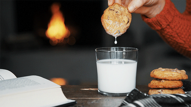
On Quora.com I came across a thread discussing the most popular cinemagraphs on the web. There were a variety of cinemagraphs on this list that redirected you to Reddit to see the enlarged cinemagraph and viewers comments. Some of the cinemagraphs on this list I saw earlier on fixel.com, but there were a few I was unfamiliar with. In particular the “Empty and Waiting” cinemagraph caught my eye. The quality of the cinemagraph wasn’t the best, but the subject matter and loop was very well executed. Something like a spinning cup (on its side) and a spinning coin (in the background) is a very challenging composure to loop. Since a cinemagraph is usually only a few seconds long and must loop this animation shows that you can create a seamless loop while controlling a physical objects motion. It is apparent that this cinemagraph had to be very well timed and shot in order to make this into a successful cinemagraph. You can check out “Empty and Waiting” by @Lenn_eavy here.

Animation #5 - PHLearn Cinemagraph's

Arron Nace from PHLearn is an excellent teacher. I have watched his YouTube tutorials when I started my education as a graphic designer in college. I stayed pretty up to date with his latest posts over the years, however have not seen any of his tutorials on cinemagraphs. I was thrilled to come across this inspiring video of his on cinemagraphs. The video was very basic, but it outlined all of the important steps from taking footage to exporting your cinemagraph properly in Photoshop. I found that this tutorial was a great piece of inspiration to fall back on if I was experiencing any trouble with my cinemagraph process.

Creating Your Own

#1 - Cinemagraph

For my first cinemagraph I wanted to focus on the foreground, middle ground, background composition without manipulating the cinemagraph like some of the tutorials recommended. I decided to  to use Poland Spring water bottles as my subject matter. It was important that I made sure my background was clear of any other objects that would degrade the value of the foreground/background composition I was aiming for. I bought 2 white pieces of poster paper at Michaels to balance lighting and make my subject matter pop off the white poster paper.

Sketching my composition allowed me to experiment with layouts without having to move my subject matter around. (Resulting in dented poster paper or water spills). Due to my sketches I knew exactly where I would position the water bottles. I positioned three in the back out of focus (background) and a glass bowl/water bottle in the front in focus (foreground).

After taking a clean photograph (prior to taking footage) and recording the water pouring into the bowl I was ready to bring my footage on to my laptop. I took a few videos of the composition, so I went through my footage to pick the best one. The forth time I actually got my whole setup wet 🙁 , so I had to replace the white poster paper for my next cinemagraph. 🙂

I imported my footage and photograph into After Effects. Originally I wanted to have the water in motion and the water bottle/glass bowl still, but after playing around with my footage I decided the cinemagraph looked better the other way around. I was surprised since most of the cinemagraph’s using liquids were the other way around. After adjusting the lighting and and using the pen tool to mask the motion I was set.


Taken with Cannon. (Edited in Adobe After Effects.)

Photoshop

#2 - Cinemagraph (Food Levitation)

I chose to do a food levitation for my next cinemagraph. It was definitely a lot more time consuming than the prior cinemagraph. However, editing the footage in Photoshop was some what easier than I expected.

My work is inspired by Vega Bund’s (@Vega.bund) pancake/syrup levitation you can see his in action here and watch how he did it here. For my piece I wanted to do something different than pancakes/syrup. I chose to use strawberries and chocolate syrup. I was slightly concerned that the strawberries might not work as well considering they weren’t as long and flat as the pancakes used in Vega’s cinemagraph. However, aligning the strawberries in my set allowed the chocolate to hold a continuous flow off both strawberries into the yogurt.

Constructing the setup was a bit tricky. I used forks to levitate the strawberries. I inserted the opposite end of the fork into a pile of books I had on both sides of my set. It took some time getting the forks positioned just right to allow the chocolate to run down both strawberries into the yogurt. I was petrified of getting chocolate all over my set (like I previously did with the water on my last cinemagraph), so I focused on making sure the alignment was just right.

I pressed the record button on my camera and got ready to squeeze the chocolate onto the first strawberry. The flow came out rather chunky at first, but then started to hold a better stream. I was relieved that the chocolate smoothly touched both strawberries before going into the yogurt.

After I finished recording my chocolate strawberries I brought my best footage into Photoshop. Photoshop was a great tool for this cinemagraph, because there was a lot of manipulation and improvements to make in my footage.

I used the pen tool in Photoshop outline my subject matter. After outlining the subject matter I pressed the masking button in my layers panel to bring through the photograph I had under my video layer without any props. At first I kept the stream of chocolate coming down in my cinemagraph, but then found that having the stream of chocolate starting from the strawberry gave a better affect and went well with the surreal theme I was going for.


Taken with Cannon. (Edited in Photoshop.)
I used Photoshop's guidelines to help align the first and last frame of my animation. By making the first and last frame essentially the same made my loop smoother and cleaner.
Here's what was really going on in my set. 🙂 It was important that the strawberry and yogurt were aligned just right to allow the chocolate to hit each strawberry into the yogurt.

Drone

#3 - Drone Cinemagraph

On February 10th my friends family went down the shore to take their boat out. They invited my family along with a few friends of theirs. We thought it was going to rain, but the weather turned our pretty nice. I brought my dad’s drone to take footage off the boat for my assignment.

The challenge of this cinemagraph was taking footage of boat without it moving. There always seemed to be some current pushing the boat either forward or backward when we were not moving. I had concerns about the drone being pushed by wind, however the drone was extremely stabilized in the air without moving it. It was surprisingly a great camera to shoot a cinemagraph.

After I uploaded my footage I edited my cinemagraph in Photoshop, since I knew there would need to be additional manipulation done to the video clip. It was important that the loop was clean and consistent. Originally, I planned to only make the water move in this cinemagraph. However, I decided to play around with the other components in the video before settling on my idea. I first started masking the trees, then the water and then the sail. After experimenting with different compositions I felt the best combination was animating the water in front and behind of the sail boat as well as the back sail.

Taken with DJI Mavric Pro. (Edited in Photoshop/AfterEffects/Adobe Encoder.)


Taken with DJI Mavric Pro. (Edited in Photoshop.)

I enjoyed taking footage for my sailing cinemagraph with a drone, so I decided to take one more on an even windier day. I felt like I got better at taking/editing the cinemagraph footage the further I got with my readings and work, so I wanted to play around with a few more ideas I had and techniques I learned. For this cinemagraph I took the footage at Sandy Hook Bay in Atlantic Highlands with the DJI Marvic Pro. I thought this was a good example of how stable the DJI Pro can shoot a cinemagraph on a windy day. I animated the smaller flags and wind anemometer while masking the flag, skies, and waves.

4 Facebook Twitter Google + Pinterest
Module 1 – Basic Animation

Module 1 - Animated Storytelling & Basics

Professor Golden chose a great book for us to read this semester. I was put ease to find “Animated Storytelling” by Liz Blazer was a step-by-step guide into animation and motion graphics. I have to admit I have always struggled to grasp an efficient animation process as a UI / UX Visual Designer. This is mostly because I skipped essential steps during my process or use the wrong tool. Most of the time I find myself spending more time solving the problem and less time aligning my work to a functional workflow. I am really looking forward to learn the steps for a more productive and efficient animation/motion graphic from this semester.

Introduction: Storytelling

Introduction

Liz Blazer’s Introduction focused heavily on the use of storytelling for both animation and motion graphics. Animation is a limitless medium for storytelling and is the key to a successful animation. Liz Blazer’s book will allow us to learn how to create memorable stories using animation and motion graphics following 10 simple guidelines (Concept development, Pre-production, Story-boarding, and Design). It was comforting to read that skilled storytellers specialized in animation are in high demand and their opportunities are expanding. I was excited to read in Liz Blazer’s Introduction that each chapter would end with a short assignment. This will not only increase our animation portfolios, but allow us to physically work with the theory that we learned during the each chapter. It is so important that we reinforce what we read, especially when it comes to animation and motion graphics.

Liz Blazer’s Introduction also discussed the two forms of animation. Liz Blazer made it very easy to understand the difference between animation and motion graphics. She expresses they are two forms of animation that often are treated as if they come from completely different worlds. Animation (for the most part) has been placed into the film making discipline and Motion Graphics has been part of the Graphic Design discipline.

"Animated Storytelling" by Liz Blazer

Chapter One

Chapter One: Pre-production

The first chapter of “Animated Storytelling” was both exciting and informative. The chapter was filled with a lot of great tips, explanations and useful examples. Animated storytelling is all about planning. Every animated story should answer three essential questions (What is it?, What does it look like?, and What is it made of?) prior to animating. Liz Blazer explains these three essential questions are answered in Concept Development, Previsualization, and Asset Building.

Concept development brings written/verbal clarity to exactly what you are animating and ultimately shapes your story line. Creating a creative brief is an extremely important task for you to complete during this phase. You will answer questions such as, Who is it for, how long it must be, what is the objective, when is it due etc.  This is not only extremely helpful to keep you on track, but also useful for your clients to understand the requirements. Crafting your elevator pitch, tagline, plot and theme are also necessary steps to construct a compelling story.

Previsualization is the next phase in your quest to answer your three big questions. During this phase you will focus on visual development and concept art. Liz Blazer, says “this stage helps define the look and feel of your production of your production before it begins”. All great work derives from inspiration. So, it is important to not only get your inspiration from giphy search but also watch a lot of motion graphics, animated shorts and commercials. Experimenting with design direction to tell your story from your concept development stage is also an essential part of previsulaization.

Asset building is the last phase Liz Blazer touched upon in Chapter 1. This is where all of your pieces come together to form your animation. Liz Blazer references them as, “all the stuff you’ll need to go in there to make the magic happen”. Creating an organized system with well marked files will be an important step during her last phase.

Here’s Liz Blazer’s quick reference when it comes to Pre-production

Pre-production Recap

  • Write a creative brief.
  • Identify your big idea and create a storyline.
  • Develop an elevator pitch and tagline.
  • Determine your project’s look and feel through influence and experimenting with design direction.
  • Make changes to your story based on design decisions.
  • Begin building and organizing your assets.

Animation Inspiration

Ideation Phase

Most of my inspiration during my motion design hunt (aka research to inform segment) was discovered through multiple websites and applications. I found most of my inspiration for this segment on, Dribbble, Instagram and Giphy. I decided to collect inspiration for each of the categories we learned about in Module 1 (Frame by Frame Animation, Stop Motion Animation, Tweening, Onion Skinning with Software, & Animated Gifs). Searching for inspiring animations as well as discovering popular motion artists in this field really opened my eyes. It was great to see first hand what could be accomplished with a range of mediums and software. It was refreshing to further explore one of my favorite motion design artists Jonathan Dahl motion designs during this research to inform segment. Jonathan Dahl has been a big motion design fan of mine for years now.

Animation #1 (Onion Skinning)

I love animals, so I was immediately attracted to this fish onion skinning sketch. As you can tell the artist did a excellent job on the anatomy of the fish. It’s realistic anatomy and smooth transition makes this fish come to life right off the paper.

This is one the first stop motion animations I came across during my research phase and also one of my favorites. It is neat to think that a number of photos were combined to create this animated affect. I also like how the artist used her hand in her stop motion animation. The combination of cut out paper and hand movement makes for a successful composition.

The idea of using a wide range of materials to create a stop motion animation has peeked my interest this semester. Origami is such a fun arts and craft activity for both kids and adults. To see the paper come to life to form these delicate figures is such a fascinating site. This was a unique and also enjoyable stop motion animation I discovered.

Animation #4 (Frame by Frame Animation)

This frame by frame animation was both inspirational and educational. It helped me form a better understanding of the difference between “tweening” and “frame by frame” animation. I would highly recommend it if you have a hard time understanding the difference between “tweening” and “frame by frame” animation. This little guy is inspirational since it has showed me how much time and effort goes into a clean frame by frame animation.

Animation #5 (Animated Gif)

This animated Gif was created by Gal Shir and is called “Cacti”. I like the sense of humor Gal Shir captures in his Cacti gif. You can feel the emotions of the cacti as the bubble hits the side of the cacti ever so slightly. It is evident that Gal used a number of frames to compose his smooth animation. Most of the animated Gifs I discovered were on Dribbble.com.

Animation #6 (Animated Gif)

“Wave AZZL App”
By: Jonathan Dahl

This is one of my many favorite gifs of Johnathan Dahl. He has such an eye for animation. His smooth transitions and use of storytelling catches your eye in this animation. His gifs always seem to be full of life and embody a good sense of humor just like this one does. I also like how the swimming tube around the purple character transforms into the blue character.

“Morphing”
By: Frida Ek

I thought this .gif by Frida Ek was very creative. The idea of morphing objects is such a neat concept. After I found this animation I brought it into Photoshop to see Frida Ek’s individual frames. This was a great way to understand the animated transformation. I feel like this animation is a great representation of what a well-planned out animation looks like. You can take a look at Frida Ek’s work here. Who knew the egg would turn into a glass of wine?

Creating Your Own

#1 - Animated Gif

It’s amazing what you can do with a structured workflow. For this animation I wanted to focus on 3 things. Storytelling, smooth transitions and (unnoticeable) reduced file size.

I began by using an hedgehog illustration that is part of my low poly animal collection. You can learn more about my animals here. On a sticky note I jotted down a simple creative brief of what I was trying to accomplish with my animation. Once my creative brief was complete I started to develop a concept and story-line for my hedgehog. It was important to take these steps before before illustrating and animating my hedgehog to ensure for a well-planned animation.

Once I narrowed down my hedgehog concepts during my Pre-production phase, I was ready to bring my story-line to life in Photoshop. It was important to make sure the elements I was animating changed position ever so slightly on each frame. This allowed my animation to smoothly transition the snow falling on the hedgehog.

Final Gif
Experimenting with snow (Rough Draft)
Wasn't quite happy with the snow, but felt like I was making progress. (Rough Draft)

Onion Skinning

#2 - Onion Skinning

I had a lot of fun with this one and learned a lot. I researched different onion skinning techniques online as well as watched the videos Professor Golden provided us before beginning my animation. I started simple with a circle. As we learned in “Animated Story Telling” every animation starts with the basics. I drew the circles on a sticky note. Each circle slightly changed width and position on each page of my sticky note paper.

Once I completed the bouncing ball on all of the pages on the sticky note, I went back to the pages to improve them. That’s when I had the idea to transform them into something other than a “bouncing ball”. I used my iPad Pro to recreate the drawing of the circle in Adobe Draw with an Apple Pencil. Once I had the ball down I started to reshape it into my hedgehog. I thought it would fun to have him jumping rope. It was very difficult getting the rope down, however the onion skinning technique I was using allowed me to reshape the lines for my hedgehog. Making the rope colored helped me visually distinguish the line of the rope from his body.

Onion-skinning drawn on iPad Pro in Adobe Draw using an Apple Pencil.

Optional Animation

#3 - Optional (Gif)

I really enjoyed creating a gif of my hedgehog, so I decided to take on the challenge again. After illustrating the additional elements for my animation in Illustrator I took the components to Photoshop to animate my hedgehog. The hardest part of this animation was animating the bubbles. My first attempt made them appear to be a circle disappearing and reappearing rather than underwater bubbles. After analyzing underwater bubbles and bubbles created with a bubble wand on Google, I was able to sculpt my frames appropriately.

Extra

Just for fun

I really enjoyed creating these animations. I decided to make a few more for fun. I think it would be fun to continue my hedgehog animations into a series. If anyone has any future hedgehog animation ideas or recommendations I would love to hear from you. I am currently working on an iMessage Sticker application that I am hoping to use these animations in.

2 Facebook Twitter Google + Pinterest