
Module Five: Motion for Promotion (Logo Stinger)
Chapter 8: Technique
Chapter 8: Technique
Chapter eight called “Technique” was all about combining the style of your animation and story. The first paragraph presented a really good question to think about before I started to work on my animation. That question was, “Have you chosen the best animation technique to tell your story?”. I never really thought about it from this perspective. When working on my design projects I typically use the program that will be most efficient and give me the best results for what I am looking to accomplish. When it comes to animation I can see how choosing your video editing application can differentiate your style from other programs and ultimately reach a specific audience. This question definitely gave me insight what Chapter 8 would uncover.
I found it interesting to learn that animators tend to get especially defensive when the notion of using a technique they don’t already know rears its “ugly head” as Liz Blazer puts it. It can be difficult to deviate from your best-known and loved techniques. The key is to choose to tell the kinds of stories that are best suited for that specific technique.
I loved the example Liz Blazer gave from the iPod commercials in 2003. What would their commercials would have been like without 2D motion graphics or Chipotle’s film-turned advertisements? It is difficult to imagine what they would of looked like. Would it change it’s animated style or storyline?
Considering Format
Considering how your video is viewed and formatted is an extremely important step, that use to be simple. Film use to be enjoyed through commercials and TV. Technology has forever changed the ways animation is produced and shared. I can see the strong connection between technology advances and animation styles.
Here are a list of Animaiton/Motion Graphic Techniques and Styles. A few we have learned earlier in the semester (Stop motion, Hand Drawn Animation) and a few that I was unfamiliar with.
Techniques
Hand Drawn
Stop Motion (2D)
Stop Motion (3D)
2D CGI
3D CGI
Styles
Fluid Transitions
2D/Vector/Kinetic Type
Handmade
Collage
3D CGI
Learning more about 2D CGI and 3D CGI was pretty neat. I actually was surprised that I knew what they were, but the “CGI” abreaction that stands for “Computer Generated Imagery” threw me off. I originally guessed that it stood for “Computer Graphic Interface” similar to GUI “Graphic User Interface”. I can definitely see myself getting more into 2D CGI animation with my low polygon animals.
Workarounds
At the end of Chapter 8 the focus was on workarounds if you did not find satisfaction in your originally selected program.
Here three Workarounds for your project,
Workaround 1: Import Still Images
Workaround 2: Shoot live-action footage
Workaround 3: Staff Up
Below you will find a recap of Chapter 8, “Technique”,
Technique Recap
1. Consider the Format
2. Translate Your Story
3. Consider Many Techniques
4. Consider Many Visual Styles
5. Adapt Your Technique
6. Workaround Using a New Technique
7. Import Still Images
8. Shoot Live-Action Footage
9. Staff Up

Animation Inspiration
Ideation Phase
1. "Arc"
The Lion King (and finding Nemo) are two of my favorite Disney movies. What’s great about Disney movies is that they tend to capture 10 of the principles of animation within minutes. This catches the audience’s attention and moves the story along well.
This clip has a number of principles of animation, but what I wanted to gear attention to is the gazelles jumping (0:40). The deers spring off he ground created an arc. This arc is not only eye-catching but also very realistic. The Gazelles jumping are also a great example of Ease in and Ease out. The gazelle’s ease in as they hit the safari ground.
2. "Secondary Action"
I thought picking “Finding Nemo” went well with my under the sea logo stinger theme and served the 10 principles of animation well. The characters in finding Nemo are a great example of “Secondary Animation”.
Immediately I thought of Nemo riding crash the turtle, when I thought about “Secondary Action”. Although, Crash is swimming along (Primary Animation) he is also interacting with Nemo on his back.
3. "Staging"
This is my favorite scene in “Happy Feet” and also shows a great example of “Staging”. It directs the audience’s attention, and make it clear what is of greatest importance in a scene is which is escaping the killer whales. Although, this principle is known in theatre and film it also presents itself in digitally animated films such this “Happy Feet” scene. I absolutely love the sense of humor that pushes this principle to the next level.
4. "Squash and Stretch"
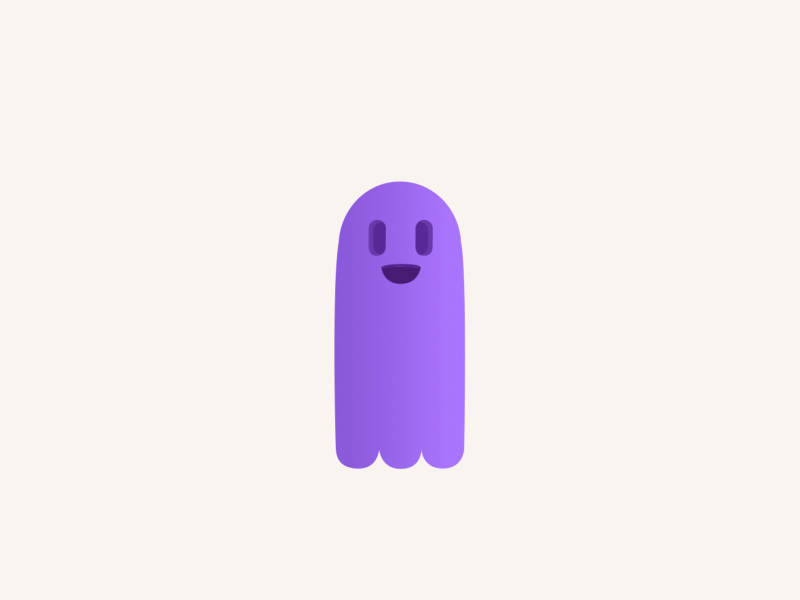
“Squash and Stretch”
I love how the principle of “Squash and Stretch” gives a sense of weight and flexibility to an hand drawn or animated object. It reminds me of the animated flip books we made when we were younger of a bouncing ball in the corner of our notebooks. For this principle I decided I would find an animation that uses something other than a bouncing ball, like most squash and stretch animations do.
I came across this animation by Drake a Canadian Animator on Dribbble. It caught my attention since it was a “Squash and Stretch” example that did not use a bouncing ball. Further more, this animation caught my eye due to the personality captured in the purple ghost like creature. The shape of the ghost alters, but the volume stays the same.
5. "Follow-through & Overlapping Action"
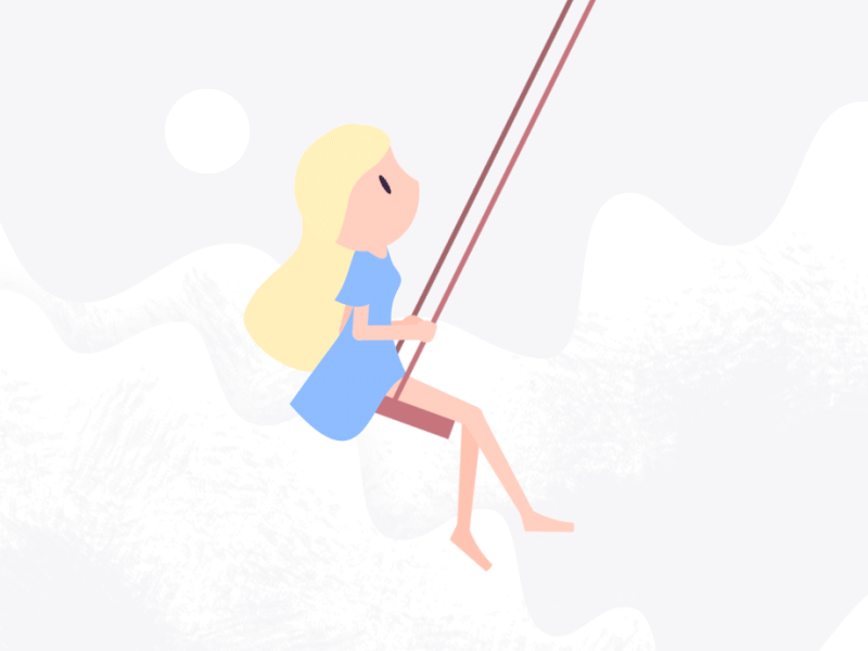
Follow-through & Overlapping Action
Searching for an animation that used the follow-through technique and overlapping action was a lot of fun. I found this animation on Dribble by Dan Stack. He has an assortment of animations that represent a number of the animated techniques we learned in our Module these 2 weeks. His animation of a girl on a swing, is a great example of follow-through and overlapping action. When the girl swings forward her hair, dress, legs, head etc.will continue to move in order to catch up. Other than nailing the technique I absolutely love the simplicity he used to convey follow through and inertia.
6. "Ease in, Ease Out"
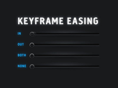
Ease-in Ease Out
Fraser Davidson is a Animator and Designer based in London. I have been following his work for some time now, but have not come across this key framing animation. It’s a great example to show you what the Ease In and Ease Out technique is all about. Further more it captures what both combined look like and none at all. I think this is a great representation and comparison of an Ease In and Ease out technique.
If you read through the comments for this Dribbble post it is interesting to see what some people consider “ease in” and “ease out”. Surprisingly, people often get these two confused since different programs (web vs after effects) have ease in and ease out the other way around.
7 "Arc"

Arc
The Arc was an interesting principle of animation to search for. I found that many animations use arcs, however I chose an animation that showcased the principle clearly. As you can tell sergey voronov’s white dot follows the light blue dot in a curved path also known as an “Arc”. What is interesting about this arc is that it follows the latest google motion design guidelines. Check this out Sergey even made a live prototype of his dots creating arcs! http://share.framerjs.com/
8. "Secondary Action"
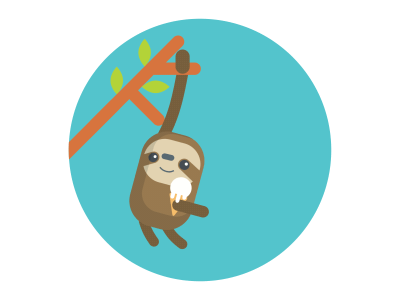 When I first read “Secondary Action” in the list of principle animations the first thing I thought of was dominos. Strange I know. I thought of a stack dominos from the chain reaction that happens when one hits the other, if all the dominos are in a tight line together. Interesting enough I discovered that Secondary Action is any action that results from the primary action. Adding this principle to the main action gives the scene more life by supporting and enhancing the main action.
This animation is absolutely adorable and also uses the principle of “Secondary Action”. The sloth swinging is the “Primary Action” and him licking the ice cream is the “Secondary Action”.
Creating Your Own
Introduction
Overall this project was a lot of fun. I learned a lot about After Effects during this module. Such as adding animated effects, adjusting sound tracks, organizing my file, etc. Reading about the 10 Principles of Animation prior to creating my animation and discovering animations specific to it online was helpful. This not only inspired my creations, but also gave me direction with the tips it provided.

Orca Logo Stinger
When I read that we can use our own logo I was excited to begin. I knew I wanted to use my logo orca, but knowing how to execute it before getting into the module was unclear. At first I wanted to do something very similar to my stop motion animation, which created the whale with triangles. I dabbled in Polygon CSS in pen code originally and then moved over to Youtube for low polygon animation tutorials. I came across a Youtube video by James White. His tutorial explained how to use low poly triangles to create a rose within After Effects. His process was tedious, but made for a really cool effect.
Sound Effects:
For the sound effects, I really wanted it to feel like you were at the beach with the water washing up on the shore. Dolphins and orca whales jumping in the background. I found the ocean waves, dolphin/orca whale callings, etc. for free on freesounds.com. It was important that the sound effects went with the animations exits/opening/ending. I also had the volume drop on the music at the end to allow the dolphin callings to be more apparent.
Music:
I wanted to use a happy up beat tune like my previous animations. I also wanted to choose a song that paired well with my orca calling noises. It was important that the music didn’t over power the sound effects even at a lower volume.
Animation:
Watching how-to YouTube videos really helped me with the animations transitions. I found the After Effects “Effects Panel” extremely fun to play with and resourceful. After adding the effects I also applied Ease in and Ease Out to them on my timeline to capture the “Ease in, Ease Out” principle of animation.
Test Animation


Completed Logo Stinger
It was a lot of fun matching the sounds of the orca as well as it’s environment to the movements of the text. I wanted to market my website in my logo stinger as well as match effects and music with the motions and feel of my storyline.

After tracing my low poly of my orca in Illustrator I imported the composition into After Effects to follow James low polygon tutorial.

I had over 200 triangles to move into the frame for this animation. Tedious, but made for a really fun eye-catching effect.

 What I wanted to change or add to Craigslist:


 1.
1. 
 3.
3.  4.
4. 


")


