Sitemap
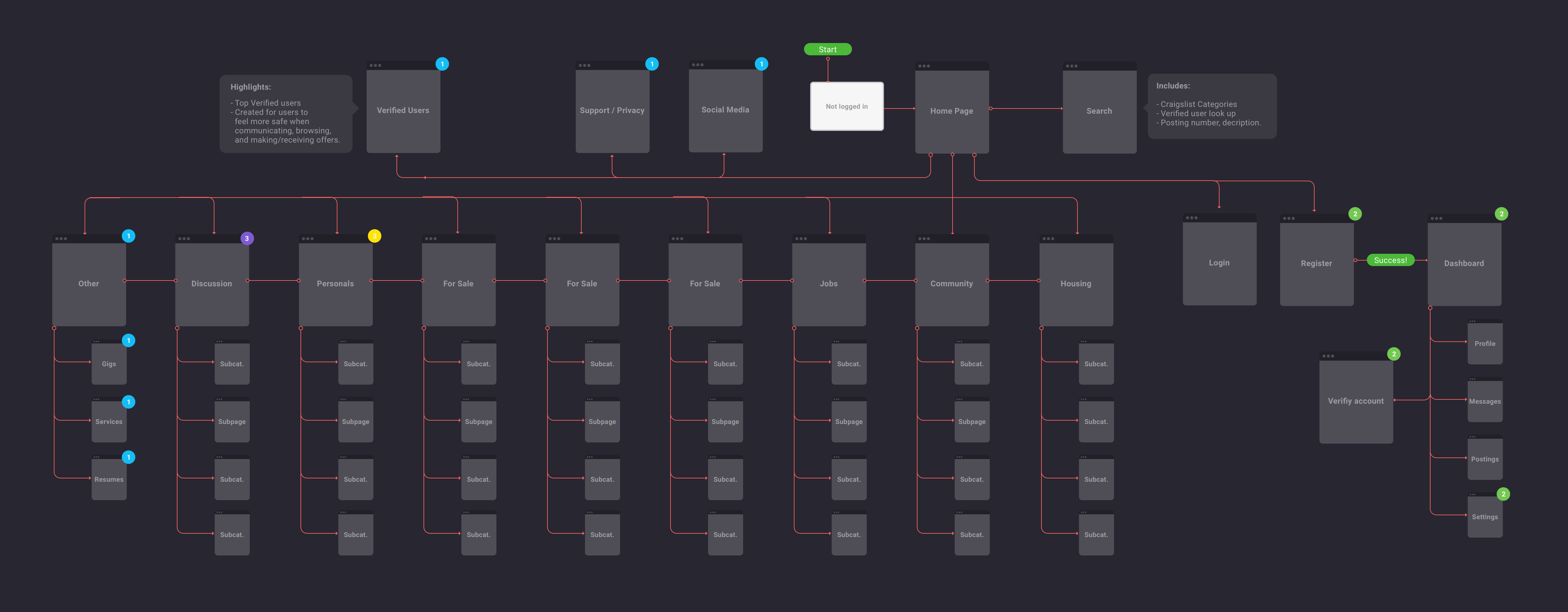
After conducting user research on current Craigslist users and completing a competitive analysis I was ready to start my sitemap. This element would be key for front-end developers, back-end developers and designers working on my redesign. What might seem obvious to me, may not to someone else touching my project. It was very important to make sure my design decisions were backed by research.
As of today Craigslist is broken up into 8 categories and 256 sub categories. It has more than 200 million user postings in 100 topical forums and more than 70 local sites in 70 countries. Using statistical data and research I was ready to start laying out the architecture of my sitemap. Here’s a great fact sheet I found on Craigslist’s website, if you are interested in learning more about these facts. While constructing my sitemap it was important for me to understand what the current Craigslist site is trying to achieve and what pain points I wanted to focus on for my redesign. There were several areas of improvement that I wanted to solve within Craigslist’s current architectural layout listed below.
Areas of Focus to Keep and Remove
What I liked about Craigslist and wanted to keep:
Reduced Number of Clicks – Craigslist’s current homepage reduced the number of clicks the user must take in order to reach their goal. I do find Craigslist.org over flooded with links. However, I would still like the hierarchy of the links on Craigslist.org to stay relatively the same. It’s amazing how you can interpret a sitemap into number of clicks. The sitemap is where I needed to focus my attention to achieve this.
Current Categories – After conducting research I have identified that the category pages currently on Craigslist have been comprehensive and straight forward for their users. I decided to keep the categories craigslist had on their site, since it seemed that these resinated best with their users. (I did make some small shifts to the categories that I get into detail later in this segment. For the most part they stayed relatively the same.)
 What I wanted to change or add to Craigslist:
Add Support Page – Although, I would like to keep the categories on Craiglist’s current site there were additional pages that I felt craigslist would benefit from. Such as a support page to provide upfront resolutions and connections with a site representatives.
Add Social Media – Currently, craiglist.com does not have any links to bring their users to their social media pages. This is mostly because Craigslist staff is very small. Craigslist’s fact sheet states that there are only 40-something craigslist staff that work out of offices located in San Francisco, California. Since this redesign requires me to push outside the boxes, I redesigned their website considering they had a larger team. Social Media is a very important element in any website looking to grow it’s users. This is why I choose to add a page dedicated to social media. I also wanted to add direct links to their social media networks on their website.
Add Verify User Page – After collecting user feedback from my family and peers in the office I identified several repeating concerns. Craigslist was “sketchy”. They did not feel safe browsing through the website. Although, I think a lot of this has to do with Craigslist’s appearance it is also apparent throughout it’s architectural layout. It was clear to me that I needed to add an additional page to my sitemap. The verify user page will require users to upload imagery and identification before they can use Craigslist. Similar to Airbnb.com security verification. Which verifies users to create a safer experience. It is evident that I may lose users this with this step, however one of the problems I wanted to solve for this redesign was to make Craigslist a safer place.
Designing for the User
When it was time to dive into the design of my sitemap, I was somewhat intimidated by the number of categories I had to play around with for Craigslist. At this moment I slightly questioned if picking such a complex site to redesign was the right choice. However, after breaking this step into smaller steps helped me become one with my sitemap. First I listed all the categories Craigslist had on paper. I removed, added and edited page titles I wanted to redesign for my sitemap. After I had everything on paper I numbered and moved pages around to formulate a hierarchy of my pages. Once this was complete I brought everything I had on paper into a visual sitemap.
I designed my sitemap in Sketch using a free template provided by Greg Dlubacz at http://uxflow.co/. It includes bubbles and arrows to easily customize your sitemap. I would recommend anyone with a simple or complex web structure to check it out. Definitely a bookmark material in my opinion.
This Sketch template also came with a few colored circles with numbers inside of them. I assumed they were to number the hierarchy of pages. However, I ended up using them a bit differently. The circles on the pages highlight specific flows that I edited or added to my redesign. Their color and number identify which flow they belong to below.

