Top Posts

Social Media Concepts

Fitbit App Gallery Survey

Summary:

This document showcases a plan for conducting a survey to help the development of Fitbit’s App Gallery mobile application redesign.

The Goal:

The goals of this survey is to gain more information about the users who use Fitbit’s App in order to improve the efficiency, productivity, and end-user satisfaction in Fitbit’s App Gallery.

Problem:

The Fitbit App Gallery is a young application that needs to preform additional research to improve it’s overall experience.

Tools Used:

Sketch, Photoshop and Keynote.

Fitbit App Gallery History:

Fitbit creates wearable products that change the way we move. Their goal is to empower and inspire their users to live a healthier, more active life. Their wearable products and online/mobile application experiences fit seamlessly into their users’ life so they can achieve their health and fitness goals, whatever they may be.

Two years ago, (December 5th 2017) Fitbit announced the release of their first mobile application App Gallery store. Formally, known as Fitbit App Gallery. Fitbit’s App Gallery was first introduced to their Fitbit Ionic users and today is now also available to their Fitbit Versa users. Somewhat similar to Apple’s App Store ,Fitbit’s App Gallery features clock faces and hundreds of apps from Fitbit, Fitbit Labs, popular brands, and developers, as well as helpful enhancements to existing features. But, do not get Fitbit’s App Gallery confused by Apple’s App Store. (Fitbit wouldn’t like that very much). Fitbit’s App Gallery attracts users with different needs and end-goals than Apple Watch users. Therefore, Fitbit’s App Gallery requires a unique and well thought out experience for their fitness users.

0 Facebook Twitter Google + Pinterest
City of Calabasas Content Strategy

Summary:

The following document contains a proposed content strategy for The City of Calabasas website redesign. The design recommendations in the documentation are influenced by the information I collected from the RFP and content strategy research we performed.

Problem Solved: 

Its purpose is to align the structure of The City of Calabasas website to their business goals and objectives. By using the business goals and key performance indicators I was able to prioritize the importance of The City of Calabasas’s content objects.

Tools Used: 

Sketch, Photoshop, WordPress and Screaming Frog SEO.

0 Facebook Twitter Google + Pinterest
Fitbit App Gallery Interview

Summary:

This document showcases a test plan for conducting an interview to help the development of Fitbit’s App Gallery mobile application redesign.

The Goal:

The goal of the Fitbit App Gallery interview is to establish a baseline of user performance, validate user performance measures and identify potential design concerns to be addressed in order to improve the efficiency, productivity, and end-user satisfaction in Fitbit’s App Gallery.

Problems Solved:

  • Understand the user’s behaviors, motivations and goals. Understand what roadblocks
  • Fitbit’s App Gallery users encounter in achieving their goals.
  • Extract general psychographic attributes, get to know their basic backstory and gather basic demographic information.

Tools Used:

Sketch, Photoshop and Keynote.

Fitbit App Gallery History:

Fitbit creates wearable products that change the way we move. Their goal is to empower and inspire their users to live a healthier, more active life. Their wearable products and online/mobile application experiences fit seamlessly into their users’ life so they can achieve their health and fitness goals, whatever they may be.

Two years ago, (December 5th 2017) Fitbit announced the release of their first mobile application App Gallery store. Formally, known as Fitbit App Gallery. Fitbit’s App Gallery was first introduced to their Fitbit Ionic users and today is now also available to their Fitbit Versa users. Somewhat similar to Apple’s App Store ,Fitbit’s App Gallery features clock faces and hundreds of apps from Fitbit, Fitbit Labs, popular brands, and developers, as well as helpful enhancements to existing features. But, do not get Fitbit’s App Gallery confused by Apple’s App Store. (Fitbit wouldn’t like that very much). Fitbit’s App Gallery attracts users with different needs and end-goals than Apple Watch users. Therefore, Fitbit’s App Gallery requires a unique and well thought out experience for their fitness users.

0 Facebook Twitter Google + Pinterest
Fitbit App Gallery Site Content

Project Summary:

This document showcases a mobile application redesign plan to help improve the design and user experience for Fitbit’s mobile App Gallery.

The Problem:

The Fitbit App Gallery is a young application that could use the help to improve it’s users overall experience.

The Goal:

The goal of this document is to provide suggestions and recommendations the Fitbit App Gallery team can use to improve the efficiency, productivity, and end- user satisfaction within the Fitbit App Gallery.

Tools Used:

Sketch, Photoshop and Keynote.

Fitbit App Gallery History:

Fitbit creates wearable products that change the way we move. Their goal is to empower and inspire their users to live a healthier, more active life. Their wearable products and online/mobile application experiences fit seamlessly into their users’ life so they can achieve their health and fitness goals, whatever they may be.

Two years ago, (December 5th 2017) Fitbit announced the release of their first mobile application App Gallery store. Formally, known as Fitbit App Gallery. Fitbit’s App Gallery was first introduced to their Fitbit Ionic users and today is now also available to their Fitbit Versa users. Somewhat similar to Apple’s App Store ,Fitbit’s App Gallery features clock faces and hundreds of apps from Fitbit, Fitbit Labs, popular brands, and developers, as well as helpful enhancements to existing features. But, do not get Fitbit’s App Gallery confused by Apple’s App Store. (Fitbit wouldn’t like that very much). Fitbit’s App Gallery attracts users with different needs and end-goals than Apple Watch users. Therefore, Fitbit’s App Gallery requires a unique and well thought out experience for their fitness users.

0 Facebook Twitter Google + Pinterest
Creating a User-friendly Survey that will get you accurate results
Pexels. User Survey Image. 10 February 2019. Web. https://www.pexels.com/photo/person-writing-on-notebook-669615/.

How to Creating a User-friendly Survey
that will Get you Accurate Results

Writing your first user survey requires a lot of time and patience. Not following common user survey practices will leave you with results that will potentially hurt your future marketing, design, and business decisions. Once you understand the basics of user surveys you will be on your way to creating a user-friendly survey that collects useful results. This blog post will cover common user interview mistakes, so you can avoid them moving forward.

Relevancy and Accuracy

Relevancy, (the state of being closely connected) and accuracy (the state of being correct or precise) are two important factors to keep in mind when creating a user survey. A well-structured user survey that contains simply written questions will help you collect valid survey responses (Survey Monkey, 2019). Relevancy and accuracy drive the outcome of creating a reliable survey.

The following topics below are common mistakes found in user surveys. It is imperative to follow these topics to collect accurate and organized data.

Your Objective

Be sure to be well prepared with all the information you need before starting your user survey. This includes an overall objective of your survey and information you want to collect from your users. With your objective and information in place, you will be able to research objectives into a set of “information requirement”.

Word Choice

It is important to construct a clear user survey with direct questions and answers that use language that survey participants will understand. Although, you will want to be very precise with your questions word choice is key. Staying away from big words and phrases they may not understand will improve the overall clarity of your survey (Survey Monkey, 2019).

Also, be sure to not to lead your questions to suggestions. Overloading your questions with suggestive language will result in inaccurate results. For example, Mark Dixon uses this question “Now that you’ve seen how you can save time, would you buy our  product?”

to explain to his readers that this leading question will rely more on the participant’s emotions more than their facts (Dixon, M, 2019 Par. 4-6).

Grouping Topics

Grouping your survey questions into topics is a very important step that inexperienced survey authors often forget. To prevent yourself from shuffling questions around once you finish your survey you will want to create the structure before jumping in. This means grouping your questions by topic. For an example, the first five questions of your user survey can be on demographics, next five questions on your participant’s behavior, participates use with your application, website or product, and finally their knowledge of your survey subject. This will not only improve your participate’s experience with your user survey but also keep you organized when it comes to collecting your results.

Answer Types 

When it comes to creating the answers to your questions for your user survey it is extremely critical to utilize refined answer types. This includes but is not limited to, yes/no answers, likert scales, multiple choices, etc. These answer types will get you precise data that you can use to improve your application, website or product. Using a few open-ended can be done if absolutely necessary. However, open-ended answers are not recommended because they require a lot of extra time when it comes time collecting your results. Unless, your survey has ten or less participates stay away from open-ended answers as much as you can.

Here are a few Other Common Survey Mistakes:
  • Redundant questions
  • Questions that you do not need the answers for
  • No demographic questions
  • Questions without visuals
  • Sampling Error (Stanley, 2011 Par. 6-8)
  • Measurement Error (Stanley, 2011 Par 9)
Sources
Survey Monkey. 10 February 2019. Web. http://s3.amazonaws.com/SurveyMonkeyFiles/SmartSurvey.pdf.
Image Source
0 Facebook Twitter Google + Pinterest
Understanding the Audience to Drive Traffic
Pixel Photos. Team Photo. 2 February 2019. Web. https://www.pexels.com/photo/woman-in-black-coat-1181346/

The Success of Driving Traffic

For our Free Blog Post topic, I decided to select 5 websites that successfully drove traffic to their site and identify why their users are attracted to it. I first started by thinking of my favorite brands/websites and what was so unique about them. (Fitbit.comApple.comAirbnb.comNike.comTheNorthFace.com) Understanding, why I liked these sites was a great first step to understand why their audience is attracted to their website.

The 5 Sites

Below you will find 5 sites I choose to demonstrate this with a brief summary of what they are successfully doing to increase traffic, time-on-page, conversion rates and referral traffic. Scroll down further to see how these points are successfully driving traffic 🙂 :

5 Sites Driving Traffic Successfully:

1. Airbnb– Does a great job marketing their content through story-telling. Further more, they use SEO keywords to expose their listings and use responsive design to improve their Google search ranking.
2. Adobe Stock – Converts their users to subscribers with great deals and brand value. Being a contributor adds an incentive to become a subscriber and exposes your photography to millions of people. Their Free Month Trial and 10 free images to get started is a win, win.
3. Save Our Oceans –  Uses email marketing to successfully bring users to their site and make online purchases. Great offers = happy customers = sharing post and word of company.  They also do a great job keeping their audience engaged and educated on all of their social media platforms.
4. M&M – Targets their users by age to provide personalized experiences. Their M&M generator allows their customers to personalize products and share they to social media. They also take advantage of promotion code marketing on their site for their users to take advantage of.
5. Fitbit – Fitbit uses optimized videos and story-telling on their website. Fitbit also has a fitness blog that uses optimized imagery for quick upload speeds as well as SEO keywords that send traffic back to their site.

Identifying Key Traffic Components

Airbnb

Airbnb does an incredible job storytelling throughout their site. Airbnb spends approximately 23.5 million U.S dollars a year on advertising. They are valued at 31 billion U.S dollars as of May 2017, with total equity funding of around 3.3 billion U.S dollars. Airbnb’s content strategy and elaborate use of digital storytelling differentiates Airbnb from their competitors. Airbnb stands for something much bigger than travel. Airbnb builds a mass community of relationships using technology for the purpose of bringing people together through storytelling.

The search box serves a door opening to your journey on Airbnb.com.

When you arrive on the Airbnb homepage, the first element the users will often focus their attention on is the search box. The search box serves a door opening to your journey on Airbnb.com. This is ultimately where the users will begin their adventurous digital journey. You can search for experiences, homes and restaurants on Airbnb’s website. They also give their users recommendations, such as popular reservations, featured destinations and recommended experiences based on your location. Airbnb targets their users with personalized messaging and experiences to serve them the best experience on desktop, tablet and mobile on Airbnb.com.

Airbnb is using this old-fashion marketing to continue the story you begin on Airbnb's website.

Airbnbmag takes storytelling to a whole new level on print. Airbnbmag relies on it’s users searches to determine what they will include in your personalized Airbnbmag magazine. It is evident that Airbnb is using this old-fashion marketing to continue the story you begin on Airbnb’s website. What’s interesting about this is that Airbnb’s magazine introduces a new way for their audience to interact, connect and share Aibnb’s content. Furthermore, it targets different audiences. Such as users who are not highly dependable on technology or local shops that have a Airbnbmag subscription lying around. It is amazing what Airbnb can learn and produce from online research.

Adobe Stock

Adobe Stock

Adobe Stock provides a wide range of stock images on a monthly subscription. Unlike, other stock image serves Adobe offers Creative Cloud subscribers a discounted stock image plan. This encourages Adobe Creative Cloud users to chose Adobe Stock over similar services, such as Getty or Shutterstock.

Adobe Stock Promotion

It is evident that Adobe Stock uses their content marketing promotions to drive traffic to their online stock image service. You can get 10 free images to start. Using the word free is an excellent word to use in your marketing content when applicable. This will not only drive users to your website, but also will encourage them to share the promotion to their friends and family.

Promotion offer on Adobe Stock
Google Search

Adobe Stock’s SEO ranking score over other leading brands in the stock image service.

Adobe Stock Contributors

Adobe Stock also exposes their value for those who want to contribute to their stock photo gallery. Selling your media content to the world’s largest creative community is compelling and fun. Users looking to make profit off their photography will benefit from Adobe’s service. The combination of Adobe Stock’s content marketing perks and value increase traffic, time-on-page, conversion rates and their referral traffic.

Save Our Oceans

Save Our Oceans

Save Our Oceans is not a very common site, although I found their content marketing strategy and emails to be highly interactive and positive. Their emails are essentially what gets their users in the door.

Personalized Save Our Oceans Email

I came across Save Our Ocean’s website from an advertisement on Facebook. This is how myself and thousands of other users were referred to their site. As you can see they effectively use email marketing to drive traffic to their website.

Follow up email to user

It is evident that their focus on email marketing is attracting new customers. Email marketing is a very powerful tool to convert users to customers.

I was redirected to their website here, after clicking on their advertisement on Facebook. I purchased this ring for free 🙂 (plus 4 dollars shipping and handling). This was the beginning of their personalized emails sent directly to my inbox.

If you’re lucky their ring may still be free.

Check it out – saveouroceansnow.com/products/premium-octopus-ring

M&M

M&M

M&M.com uses personalization to target specific audiences to their website. What I found interesting about M&M.com is that before you enter their site a dialog box will appear asking you what your birth date was.

Dialog box personalizes your experience on M&M.com

Although, I found this to be a bit frustrating as a user trying to access their site, I recognized the benefit that this solution provides within their experience. Depending on how old you are the site will differ. If you are 12 or under, you will see candy targeting younger kids. If you are older than 12 you will no longer see M&M’s products targeting young kids.

M&M uses promotion codes to drive traffic to their site and reduce their bounce rate. Customers who are given promotions while browsing their purchase are more likely to stay. This is why promotion codes can easily direct traffic to your website. Popular sites like and coupons.com and retailmenot.com expose promotion codes which will ultimately refer customers to your website.

Fitbit

Fitbit

Fitbit has been my favorite site since their second tracker, Fitbit Flex was introduced in 2003. So, I couldn’t help but to add it into my list. As a web designer and an active customer it’s been fascinating to see their website and mobile application evolve into a huge success. Fitbit does a great job pushing traffic to their through motivating social media content and marketing techniques.

I love Fitbit’s flat UI design elements, professional lifestyle imagery and interactive branding elements. Their product description pages combine compelling imagery and interactive elements to drive customers to their website. I find that these pages tell a great story and trigger emotional connections for users to absorb. They create lasting impressions that will bring returning users to their site. Ultimately, increasing their websites bounce rate.

Social Media

Word of mouth from leading technology companies can often generate and increases exposure and reliability. When these type of articles are shared, so does the traffic to their website.

Fitbit Coach iOS / Android application

Fit Coach is an iOS and Android application that creates personalized workouts that adjust to your capabilities, feedback and goals. The application is free and the user does not have to own a Fitbit. These qualities are important, because they will educate and introduce the user about Fitbit the brand and their website prior to purchasing their device.

Sources:
 
Adobe Stock. Web. 21 December 2019.

www.adobestock.com/about.

 
Airbnb. Web. 22 December 2019. www.airbnb.com/about.
 
Baxter, Kathy. Morgan Kaufmann Publishers Inc. Print. Understanding your Users: A Practical Guide to User Research Methods. July 2015.
 
Farrell, Susan. UX Research Cheat Sheet. Web. 20 December 2019. https://www.nngroup.com/articles/ux-research-cheat-sheet/.
 

Fitbit. Web. 21 December 2019. www.fitbit.com.

 
M&M. Web. 22 December 2019. www.mandm.com/about.
 
Save Our Oceans. Web. 22 December 2019. www.saveouroceans.com.
0 Facebook Twitter Google + Pinterest
How to Analyze Qualitative and Quantitative Data
Pexels. User Survey Image. 10 February 2019. Web. https://www.pexels.com/photo/person-writing-on-notebook-669615/.

How to Analyze Qualitative and Quantitative Data

When it comes time to analyze your data it is very important you use the correct methods to achieve accurate results. This post will discuss when to use qualitative and quantitative data, so you can analyze your data accurately and effectively.

Qualitative Vs. Quantitative

Although the words ‘qualitative’ and ‘quantitative’ sound very similar they are in fact two different ways you can collect your user research. It is critical that you understand the differences of the two user research methods before you collect any data or construct questions used for an interview, survey or user study. This will not only allow you to understand what questions you should be testing, but also save you time in the long run.

Qualitative

Qualitative methods include but are not limited to; surveys, analytics, and formal experiments (Mortensen, D. Par. 2, 2019). This user research method allows the researcher to measure aspects of the user and user behavior in a way that can be quantified and used for statistical analysis. The best way to collect qualitative data is to collect objective measurements. Objective measurements are measurements that are unbiased by the researcher’s hypotheses, presence, and personality (Mortensen, D. Par. 4, 2019).

Qualitative data provides a more in-depth understanding of the individual. The results are not expressed numerically, but rather as themes or categories that have occurred during the research.

  • Approach: Subjective
  • Analysis: Non-Statistical
  • Collection of Data: Unstructured
  • Determines: Depth of Understanding
  • Asks: Why? (Often open-ended)
  • Outcome: Develops initial understanding

Quantitative

Quantitative data collection is a method in which data can be numerically collected. This method is easier to collect than qualitative data collection and will increase the speed it takes to collect results. This data is useful for user studies, experiments manipulated analysis, surveys etc. It is typically represented by tables, charts, histograms and graphs (DB, Difference Between 15 February 2019) and uses measurements like height, length, volume, area, humidity, temperature.

For example:

Height = 2.8m. Or sometimes they represent the exact number like,

Number of students = 234.

  • Approach: Objective
  • Analysis: Statistical
  • Collection of Data: Structured
  • Determines: Level if Occurrence
  • Asks: How often or how much? (Usually)
  • Outcome: Recommends final course of action

Combining Qualitative and Quantitative Data

There are many benefits of combining qualitative and quantitative data. Many researchers combine both of these measurements for their user tests. For an example, you can use quantitative data to represent time and errors with qualitative methods such as observations and interviews. Researchers often times use the words ‘objective’ and ‘subjective’ to describe the data they collected through quantitative and qualitative methods (Mortensen, D. Par. 12-18, 2019). By combining both of these methods you can often times back up your qualitative data better or interpret your results easier.

Sources

Mortensen, Ditte. Interactive Design Foundation. Best Practices for Qualitative Data. 12 February 2019. Web. https://www.interaction-design.org/literature/article/best-practices-for-qualitative-user-research.

Difference Between. Difference Between Qualitative Data And Quantitative Data. 10 February 2019. Web. http://www.differencebetween.net/science/mathematics-statistics/difference-between-qualitative-data-and-quantitative-data/.

Image Source

0 Facebook Twitter Google + Pinterest
The Evolution of a Mental Model – Smartphone Vs. Flip Phone
[1] Pixels Images, Lady holding smartphone. Web. https://www.pexels.com/photo/person-holding-a-smartphone-892757/.
I was surprised to find what I knew about “Mental Models” before diving into our first reading assignments was only a glimpse of what a Mental Model can provide for a User Experience designer. Comparing my mom’s mental model before and after purchasing her first smartphone helped me understand mental models better.

What is a Mental Model?

A mental model is a belief of what your users thinks or knows. What a user believes they know about a user interface of a website or application strongly impacts how they use it. Mental models that derail from the objective are common, especially with interfaces that try something new (Nielsen, 2010 Par. 1-4).

[2] Product Life Cycle illustration. Image based on cartoon #5 at www.usability.uk.com/.

Understanding Mental Models

A great example of a Mental Model is a user using a smartphone for the first time in their life. The decisions they make to interact with the smartphone are based on beliefs of what the users thinks or knows. Have they seen other people use a smartphone before? What is their current occupation? Do they have a background in technology or engineering?

Smartphone vs. Flip Phones

My mom started using a smartphone for the first time in her life this year. Previously, she owned a Kyocera Cadence LTE flip phone. She was very content with the experience she received with her flip phone, however was unable to accomplish tasks that required internet access. 

[1] Image of my mom’s old phone. PC Mag. https://www.google.com/search?q=kyocera%20cadence%20lte%20flip%20phone Web. 24 January 2019. 

In Jakob Nielson’s article we learned that engineers have a ‘deep’ mental model of how TVs work that allows them to work out how to fix them (Nielsen, 2010, Par 4-12). In contrast, my mom does not have a background in engineering or cellular technology. Given this fact her mental model is very different than a user that has never used a smartphone, but does have a background in cellular technology. Although, this combination is extremely unlikely it is possible. Every user’s mental model is different per experience. By using User-Centered Design we can understand my mom’s experience with her new iPhone 8. By employing techniques, processes, and methods throughout the product life cycle we can accomplish this (Kathy, 2015, Page 7).

Evolving Mental Models

With practice and experience comes skills and knowledge. The more my mom became familiar with her new smartphone the more she understood how to use it. During this time, her mental model was shifting closer to a user’s mental model that are more familiar with cellular technology. Although, she frequently runs into issues to complete hard tasks on her iPhone 8 she has been learning from her mistakes. Everyday her smartphone mental model experience strengthens. The speed at which her mental model evolves is up to her beliefs and what she knows. Before I know it my mom’s mental model will evolve closer to an everyday smartphone user.

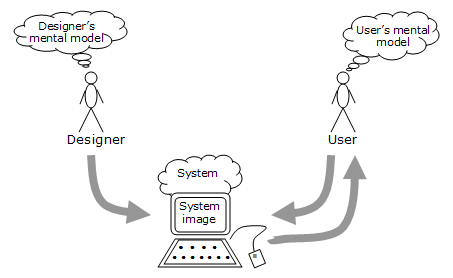
[2] This diagram from Interactive Design’s Metal Model article shows how two users with different backgrounds communicate to a system.

Sources:

Baxter, Kathy. Morgan Kaufmann Publishers Inc. Print. Understanding your Users: A Practical Guide to User Research Methods. July 2015.

Nielsen, Jakob. Mental Models. Nielsen Norman Group. Web. 23 Jan. 2019. https://www.nngroup.com/articles/mental-models/.

Image Sources:

[1] PC Mag. https://www.google.com/search?q=kyocera%20cadence%20lte%20flip%20phone Web. 24 January 2019. 

[2] Interactive Design. https://www.interaction-design.org/literature/book/the-glossary-of-human-computer-interaction/mental-models. Web. 22 January 2019.

[3] Pixels Images, Lady holding smartphone. Web. https://www.pexels.com/photo/person-holding-a-smartphone-892757/.

1 Facebook Twitter Google + Pinterest
The Importance of User Requirements vs. Business Requirements
Pixel Photos. Team Photo. 22 January 2019. Web. https://www.pexels.com/photo/colleagues-cooperation-fist-bump-fists-398532/

Fulfilling your users requirements and business requirements can be tough. However, by taking a holistic view of your users scenarios and needs can allow you to reach both your users requirements and business requirements easier. As a User Experience Designer for Verizon I find it extremely important to understand your targeted audience before starting any project. Whether you are building a mobile application, a new product or website understanding your users will go a long way.

Prior to working on Verizon’s communication team (with a great number of talented co-workers), I was a lead designer for our Personalization Team. On Verizon’s Personalization Team I was responsible for creating experiences that would be used for A/B tests on verizonwireless.com. If you are not familiar with an A/B test that is alright. Before working for Verizon, I was not familiar with the term ‘A/B testing’ before either. An A/B test is way for you to find out if ‘Page A’ preforms better than ‘Page B’. On the Personalization Team we used A/B testing as a way to collect analytics on the performance of copy, design,imagery and experiences between these two web pages.


[1] Verizon Wireless Homepage Homepage Screenshot.

[1] Verizon Wireless Homepage Homepage Screenshot.

The hardest part about being a Lead Designer for the Personalization Team was fulfilling the users requirements and business requirements for our A/B tests. The business requirements always went against brand and best user experience practices. For an example, I would receive requests to make the CTA (Call to action) more prominent and larger, increase the font size or add an explanation mark at the end of our headlines. All of these strategies were severely off Verizon’s brand. However, the Test Leads would insist to give it a go.”It is just a test Diana, only 50% of our prospects would receive this experience on verizonwireless.com.” they would say. It was very difficult to not fall into this trap of using bad practices. Especially, since I knew these strategies would increase our users click ratio. However, would not be the right experience for our users.

To bring our team and Test Leads back on the same page I would present user personas and common user scenarios for each test we preformed whenever we derailed from our user’s requirements. By stressing the importance of designing a holistic experience for our users that was on brand always did the trick for us. Creating personas based on actual user data is a great way to build and improve your product’s UX (Noetzel, 2018, Par 1). This is a very similar lesson “Satisfy the Cat, a.k.a User-Centered Design” video teaches us. Sometimes you just need to put your users’ needs in front of your business partners to bring everyone back on the same page for an assignment.

Sources:

Noetzel, Tim. How To Improve Your Design Process With Data-Based Personas. Web. 24 Jan. 2019. https://www.smashingmagazine.com/2018/04/design-process-data-based-personas/.

Satisfy the Cat, a.k.a User-Centered Design. Web. 24 Jan. 2019. https://www.youtube.com/watch?v=dln9xDsmCoY.

https://www.smashingmagazine.com/2018/04/design-process-data-based-personas/.

Baxter, Kathy. Morgan Kaufmann Publishers Inc. Print. Understanding your Users: A Practical Guide to User Research Methods. July 2015.

Image Sources:

[1] Verizon Wireless. MacBook Pro Screenshot. Web. verizonwireless.com. 25 January 2019.

[2] Pixel Photos. Team Photo. 22 January 2019. Web. https://www.pexels.com/photo/colleagues-cooperation-fist-bump-fists-398532/.

1 Facebook Twitter Google + Pinterest
Bringing it All Together – The City of Calabasas Content Strategy
Freepik.com Mockup with homepage wireframe screenshot inserted, https://www.freepik.com/index.php?goto=74&idfoto=3190483&term=laptop%20mockup [15]
Below you will find a document that contains our proposed content strategy for The City of Calabasas website redesign. The design recommendations in the documentation are influenced by the information we collected from the RFP and content strategy research we performed.

The content strategy in the documentation below was created after our content strategy alignment summary was established. Its purpose is to align the structure of The City of Calabasas website to their business goals and objectives. By using the business goals and key performance indicators we were able to prioritize the importance of The City of Calabasas’s content objects.

The sitemap included serves as a blueprint of The City of Calabasas’s entire website. The sitemap builds out a new information hierarchy for The City of Calabasas. It was important that we referenced The City of Calabasas’s business goals to ensure we conveyed and included all of their important content. Together we researched The City of Calabasas’s current information architecture to determine what they should keep, remove, move up higher in their content hierarchy or lower. Our detailed notes included a list format, an approach the Webflow blog recommended to simplify the way we convey the hierarchy of a website.

After our sitemap for The City of Calabasas was created we were ready to begin the wireframes of The City of Calabasas’s homepage and internal pages. It is evident that The City of Calabasas needed a simplified structure that allowed their users to access what they were looking for in 2 or fewer clicks. To do this we made sure important components were above the fold (features content, search, top services) on their homepage. While the sitemap serves as a blueprint of The City of Calabasas’s entire website the wireframes we created represent the blueprint for a single page (or group of pages). This will allow The City of Calabasas’s team to see how individual pages within a website will flow and function.

0 Facebook Twitter Google + Pinterest