Mood Board
Expressing my creativity prior to diving into a project is one of my favorite steps in the design process. A mood board is a collection of inspirational images to help you start a project or in this case redesign a website. I created my mood board in Pinterest for this redesign. I chose to use Pinterest to create my mood board because I felt it would be a great way to organize my content. I enabled a Chrome plugin called Pinterest Save Button, so I could easily pin content to my boards while surfing the web for ideas. Originally, I created a new Pinterest board on my personal account for my mood board. However, after collecting several pins to this board I found that it was hard to stay organized. This is when I decided to create a new Pinterest account to collect my content for my mood board. Creating a new Pinterest account allowed me to create multiple boards to explore and strictly focus on pins for my project. In addition to Pinterest, I also took photos during the week for my project. I didn’t want to limit myself while collecting content for my mood board.
Exploration
What I was I looking for
Here are a few topics that I was interested in further exploring during my Craigslist mood board exploration:
Pinterest Boards:
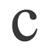 1. Curved C – Uses design elements that replicate the curved “C” in Craigslist. Smooth design elements such as smooth/round icons, boxes and typography vs. sharp design elements and boxes.
2. Purple and Blue – Craiglist’s competitor “Jet” uses purple in their branding. Craiglist’s well known peace sign logo also uses a similar color purple. I wanted to keep the purple in this redesign, however after identifying “Jet” and a few competitors with this color I decided to use a combination of purple and blue. If you are interested in learning more about the color palette for my redesign click here.
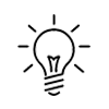 3. Light Icons – I like to look at the latest trends of the web when making decisions about my design elements. Light icons has been a moving trend this year. Companies such as Facebook, Twitter and Instagram are using light icons throughout their experiences. I was very interested in replicating this style in my redesign. I also felt that this style would work well with the “Smooth C” look I was aiming towards.
 4. Simple and Organized – As I mentioned earlier in my post there are many reasons why Craigslist.com is structured the way it is today. It remains popular because products and services are categorized with the customer in mind. It takes just a few seconds to receive results from a search. However, I feel that we can further simplify and organize the material to appeal to the customer.
Further Exploration
Semantic Exploration
As I was having a lot of fun working on this step for my project, I decided to take it a step further with a semantic exploration chart. First I wrote down three words to represent the progression of Craigslist. These three words were, Newspaper, Craigslist’s UI/UX today and Craigslist’s Redesigned UI/UX. After I had these three words written on my paper I branched words that came to mind (good and bad) when thinking about these words. After I was done I decided to highlight the words I originated from in green, good words in yellow and negative in pink. This was a fun way for me to focus and brainstorm new ideas.

Craigslist Redesign Color Palette
Check out my Craigslist redesign Color Palette next.
